8 DASHBOARDS
|
|
By the end of this chapter, readers will be able to:
|

The Use of Dashboards
A dashboard combines multiple related visualizations into a cohesive view, providing a comprehensive overview of key data. It typically combines two or more visualizations to present all critical information needed for effective performance monitoring and decision-making. For instance, a faculty might create a dashboard that merges various charts encapsulating key performance indicators related to teaching, publications, research grants, innovations, community services, and more. This consolidated view helps monitor lecturers’ performance and formulate strategies for improvement.
Dashboards allow users to instantaneously compare and explore different data sets within a single interface. They also uncover how changes in specific data points can influence other related areas. By offering this holistic perspective, dashboards enhance users’ understanding of the data and enable more informed decision-making.
Characteristics of a Good Dashboard
A good dashboard possesses several key qualities. Here are some characteristics to consider when constructing a dashboard using Tableau:
- Clear purpose and relevant data: A dashboard should have a clear purpose and compile all necessary key data needed for targeted decision-making. It should focus on delivering insights that align with its intended objectives.
- Simple design: A dashboard with a simple design efficiently communicates key messages to users. Avoid cluttering it with unnecessary information or elements that can confuse users or make it difficult to interpret the data.
- Consistent colour theme: While designing a dashboard, it’s important not to overuse colours. Choose a consistent colour theme that reflects the organization’s branding or the dashboard’s purpose. For instance, if comparing business KPIs, using the main colour from the organization’s logo can enhance the dashboard’s professional appearance and coherence.
- Interactivity: Interactivity is a crucial feature of a good dashboard. Incorporate filters or parameters to allow users to explore different aspects of the data within a single interface. This functionality enables users to perform comparisons or conduct what-if analyses, leading to deeper insights and more informed decisions. Additionally, highlight features can draw attention to key data points during presentations.
- Appropriate chart types: Use the right types of charts for the data being presented. For example, use line charts to display trends and bar charts to make comparisons. Ensure that the charts are chosen to facilitate easy identification of trends, outliers, and actionable insights without requiring extensive analysis.
Creating Dashboards in Tableau
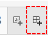
Users need to click the New Dashboard icon available at the bottom right of the worksheet to launch the dashboard workspace.
The dashboard workspace interface has some unique components compared to the standard worksheet. These components are organized based on two primary panes namely, the Dashboard Pane and Layout Pane.
The Dashboard Pane features three primary sections: Size, Sheets, and Objects.
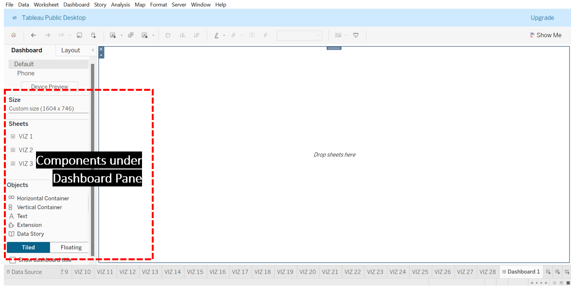
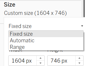
In the Size section, users can customize the appearance and dimensions of their dashboard on the screen. Tableau offers three sizing options: Fixed Size, Automatic Size, and Range Size.
- Fixed Size: Choose this option to set a specific, static width and height for the dashboard. The dimensions will remain constant regardless of the device or screen space.
- Automatic Size: This option allows the dashboard to dynamically adjust its dimensions to fit the available screen space, ensuring it optimally fills the viewer’s screen. This makes the dashboard more flexible for various screen sizes but may necessitate extra design considerations to ensure readability and usability.
- Range Size: With this option, users can specify a minimum and maximum size for their dashboard. The dashboard will re-size within these predefined limits according to the screen space available. This provides a balance between fixed and automatic sizing.
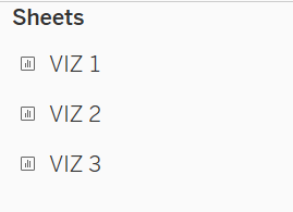
The Sheets section displays all individual visualizations and worksheets available within the Tableau workbook. From this section, users can drag and drop the selected visualizations onto the View space to design the desired dashboard.
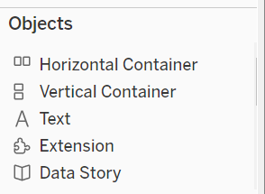
The Objects section presents various items that can be added to a dashboard to enhance its functionality or provide additional information. Following is some of the items available under Objects and their usage:
- Horizontal Container and Vertical Container can be used to organize dashboard elements like charts and filters. These containers adjust their size to fit their contents.
- Text can be applied to add titles, instructions, and descriptions to the dashboard.
- Extension allows users to add third-party tools, custom visuals, or advanced analytics to the dashboard.
- Blank is used to create empty spaces between the elements on the dashboard.
- Image can be used to include images, such as logos or product pictures, in the dashboard.
- Webpage helps embed web content directly into the dashboard.
- Navigation: Allows users to move between different sheets in a workbook for more detailed insights.
- Download: Creates PDF or image files of your visualizations for documentation, presentations, or sharing.
On the other hand, the Layout Pane provides tools such as outer and inner padding to help refine the alignment of elements on the dashboard. Additionally, it allows us to adjust borders and background colours for each visualization.
Exercise 33
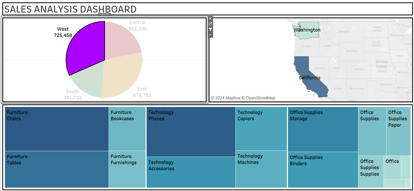
Build a simple sales dashboard combining VIZ 19, VIZ 21, and VIZ 22:
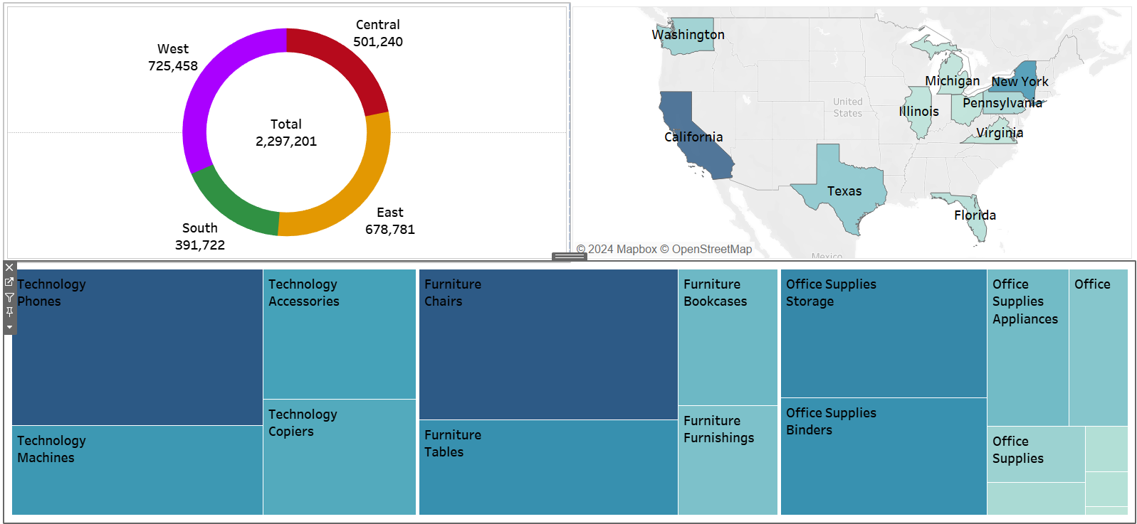
- VIZ 19 is a donut chart that illustrates sales across four regions.
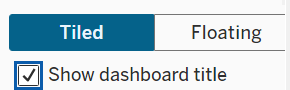
- VIZ 21 is a geo map showcasing the top ten countries by sales.
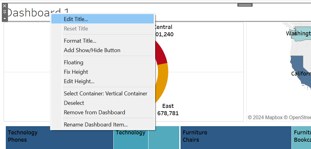
- VIZ 22 is a tree map detailing sales by category and sub-category items.
Apply automatic sizing to the dashboard and set VIZ 19 as a filter. After clicking on the West region in the donut chart, describe the changes observed throughout the dashboard.
Solution – Exercise 33
Step 1: Click the New Dashboard icon to open the dashboard workspace. Then, in the Dashboard Pane, click the drop-down menu in the Size section and select Automatic.
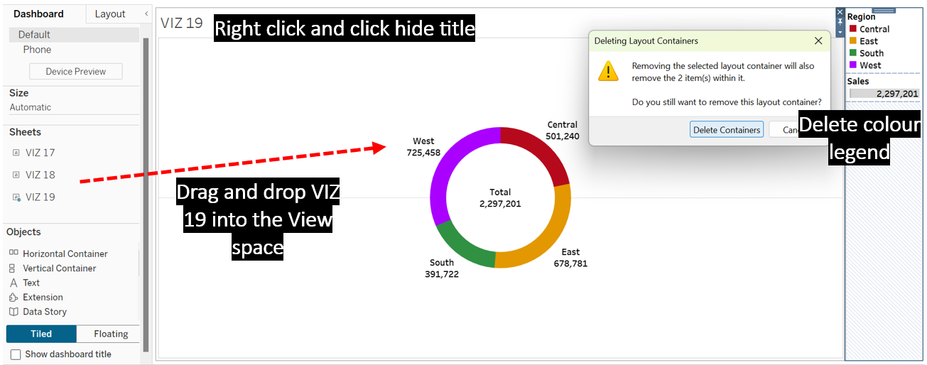
Step 2: Drag and drop VIZ 19 from the Sheets section onto the View space. To keep the dashboard organized and uncluttered, it is advisable to remove unnecessary titles, headers, filters, and legends from each visualization. For instance, in VIZ 19, we can delete the colour legend and hide the title to enhance the overall clarity of the dashboard.
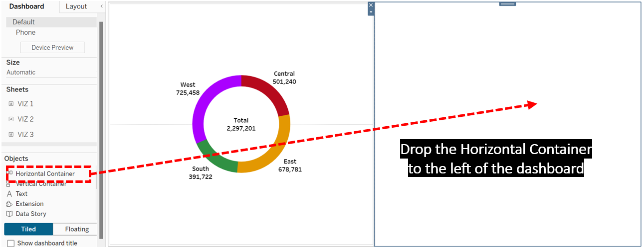
Step 3: To keep the dashboard layout more organized, place VIZ 21 within a Horizontal Container. Start by dragging the Horizontal Container from the Objects section and dropping it on the left side of the dashboard.
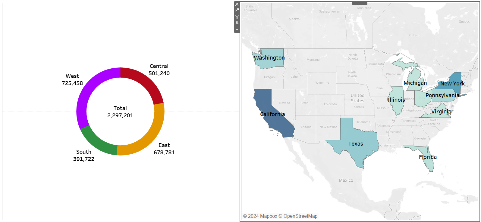
Step 4: Drag VIZ 22 from the Sheets section and drop it into the Horizontal Container. Remove the geo map’s colour legend and hide its title.
Step 5: Drag a Vertical Container and drop it to the bottom of the dashboard.
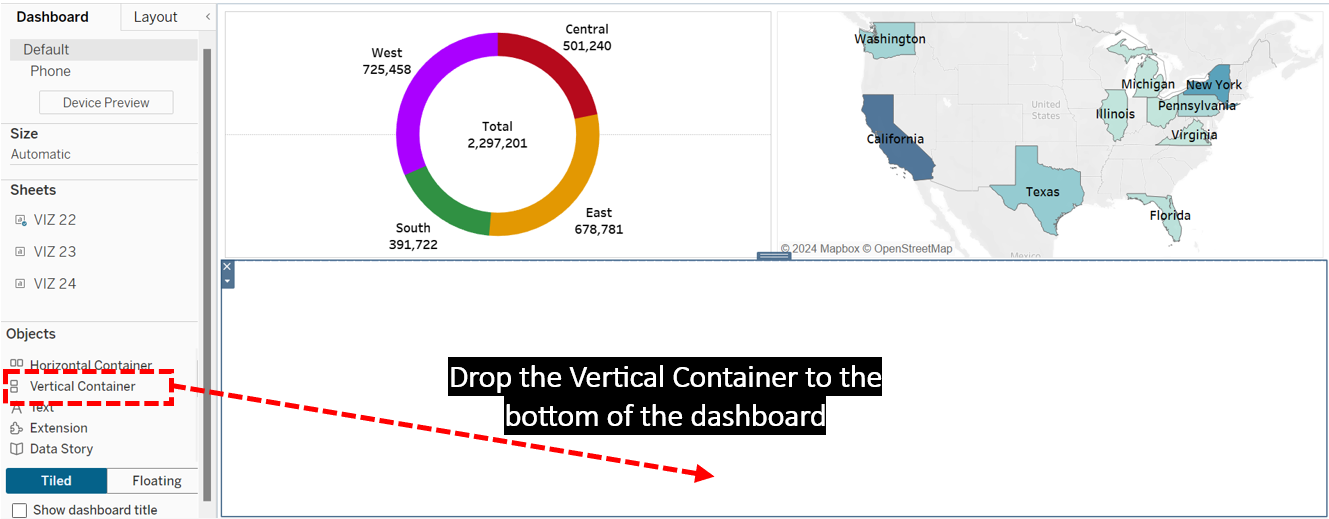
Step 6: Add VIZ 21 to the Vertical Container. Hide the tree map’s title and discard the colour legend.
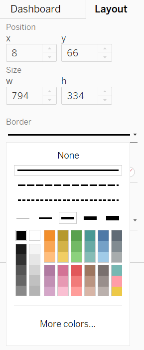
Step 7: Check the Show Dashboard Title box, which is located at the bottom of the Dashboard Pane.
Step 8: Right-click on the default title that popped up, and choose Edit Title to rename the dashboard to SALES ANALYSIS DASHBOARD.
Step 9: Switch to Layout Pane to add a thicker black border for each element in the dashboard to make the dashboard look neater.
Step 10: To use VIZ 19 as the filter for the whole dashboard, click VIZ 19, and click the funnel icon that pops up at the top corner of its container.
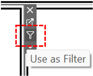
Step 11: Test by clicking the West region in the VIZ 19. It can be observed the other two charts in the dashboard respond accordingly to show data specific to that region. The geo map indicates that California and Washington are the top contributing states for sales in the West region. Meanwhile, the tree map reveals that chairs from the furniture category and phones from the technology category are the top sellers in this region.