6 OTHER CHARTS
|
|
By the end of this chapter, readers will be able to:
|

Default Chart Options
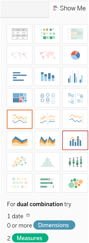
Tableau provides several default chart options beyond the traditional bar graph. You can access the list of default charts available in the Tableau environment by clicking on the Show Me button located at the top right corner of the worksheet. Some of the default chart options in Tableau include pie charts, geographic maps, scatter plots, histograms, bullet graphs, treemaps, and bubble graphs.

The types or number of the data fields required to build each of these charts can be seen when the users mouse over the related chart icon. For example, mousing over the pie chart icon reveals that Tableau requires at least 1 or more-dimension fields and 1 or 2 measure fields to construct a proper pie chart.

Scatter Plot
A scatter plot is useful when users wish to explore the relationship between two continuous fields. For example, a scatter plot can be used to examine the relationship between spending on social media advertisements and the profit earned, to determine whether higher spending correlates with higher profit.
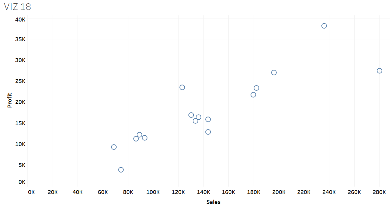
Exercise 23
Plot the data of total sales and profit according to quarter and year. Name the chart VIZ 18. Describe the relationship that you notice.
Solution – Exercise 23
Step 1: Drop the Sales field to the Columns shelf and the Profit field to the Rows shelf.
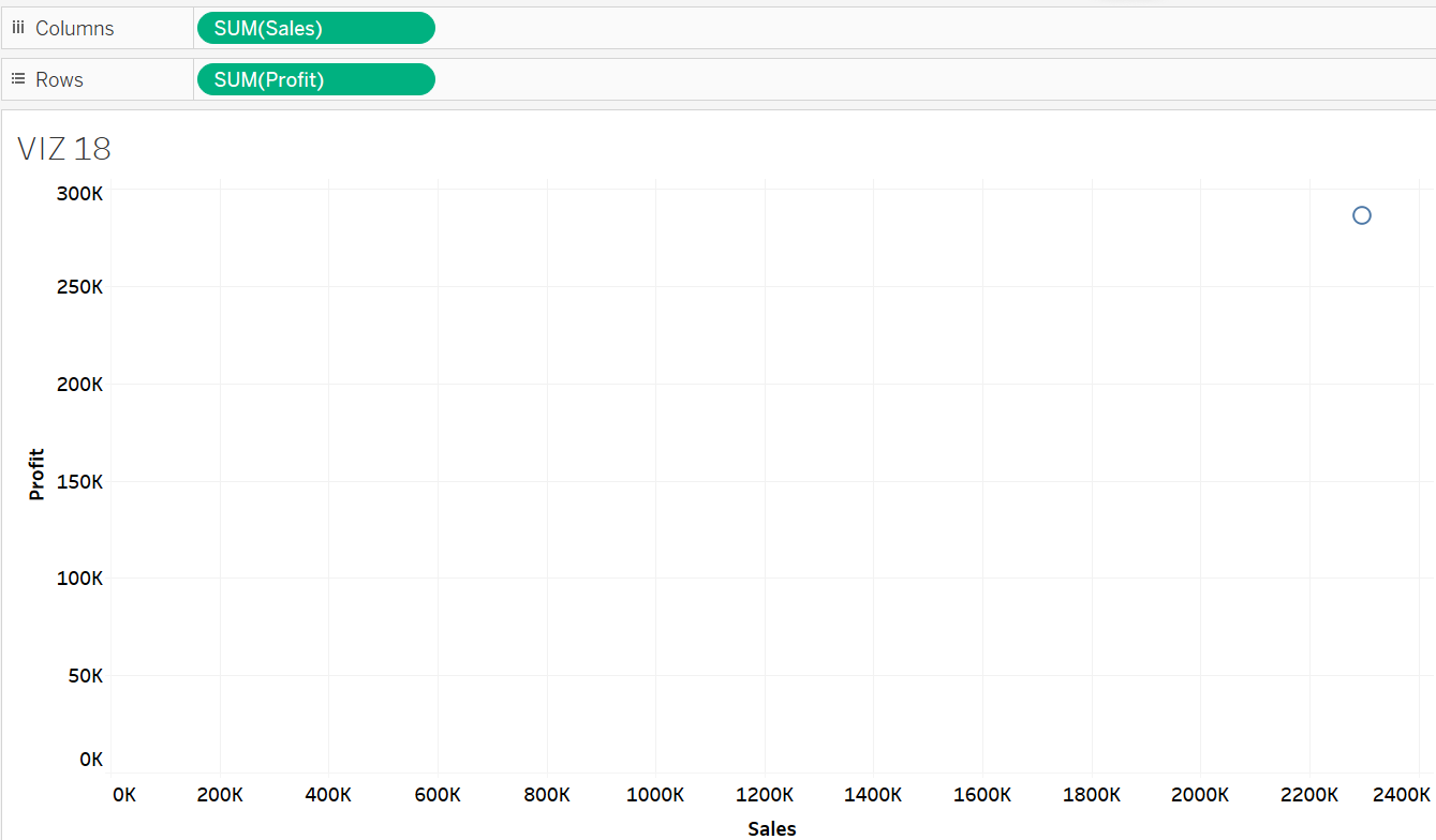
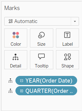
Step 2: Drop the Order Date field to the Detail Card. Expand the Order Date by quarter and year.
Step 3: A detailed scatter plot has been created to show sales and profit by quarter and year. The plot indicates a positive correlation between sales and profit, suggesting that profit tends to increase as sales rise.
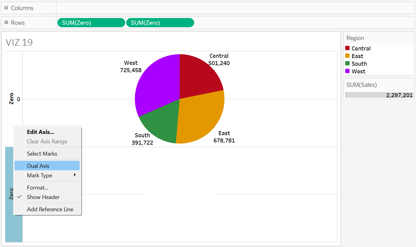
Donut Chart
A donut chart is a variation of a pie chart, but with a blank space in the centre, allowing the users to add summary information in the hollow space. Similar to a pie chart, it can be used to represent the data of different dimension items, with summary data made available in the centre space to provide additional information for the audience. For example, users might use a donut chart to visualize the article publications of different faculties within a university, and the central space of a donut chart can be used to display the total publications.
Exercise 24
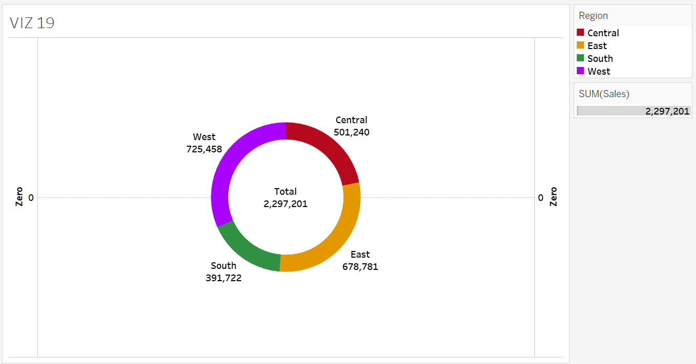
Create a donut chart where the outer ring displays sales by region, and the centre shows the overall sales. Name the donut chart VIZ 19.
Solution – Exercise 24
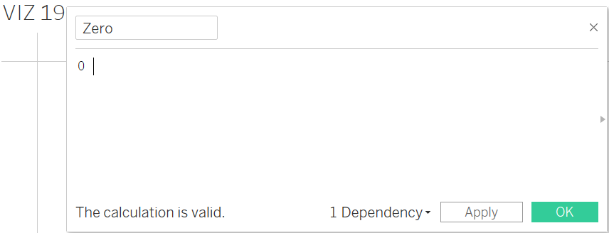
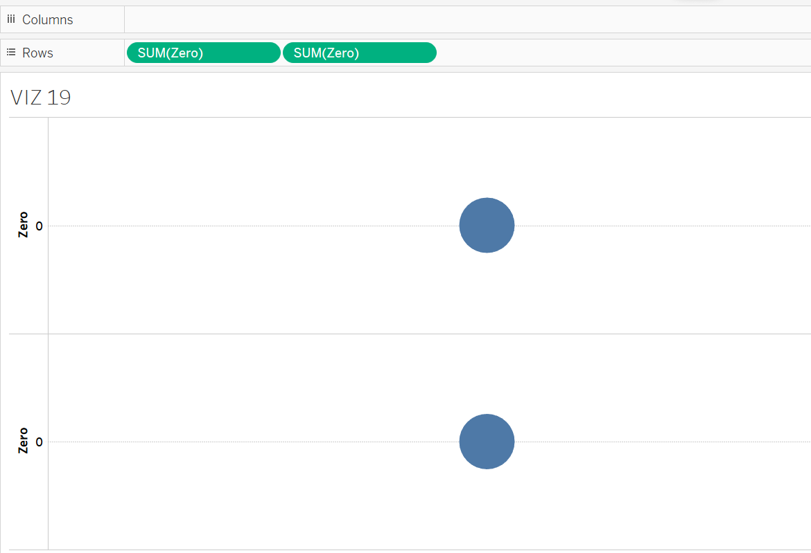
Step 1 – Open a new worksheet and name it VIZ 19. Create a constant field with the value “0”. To do so, click Create Calculated Field, name it Zero and enter the value in the calculation space before clicking Apply.
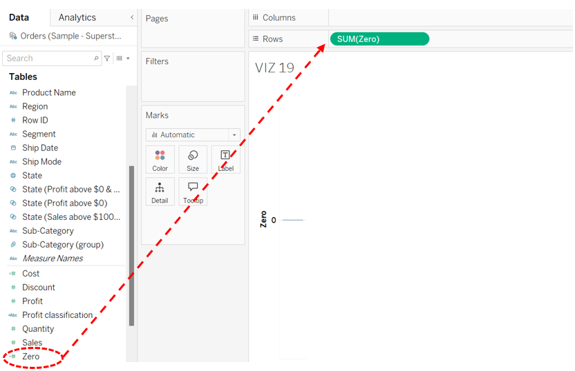
Step 2 – Drag and drop the newly created Zero field onto the Rows shelf.
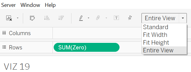
Step 3 – Switch the view from the Standard to the Entire View.
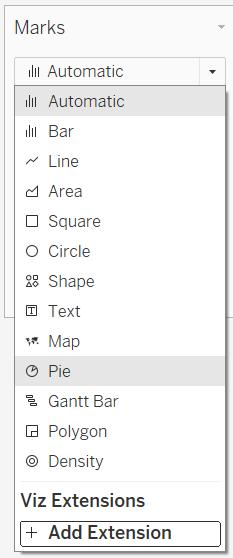
Step 4 – Switch the type of marks to Pie.
Step 5 – Drag and drop the Zero field onto the Rows shelf once more to generate an additional axis and pie chart.
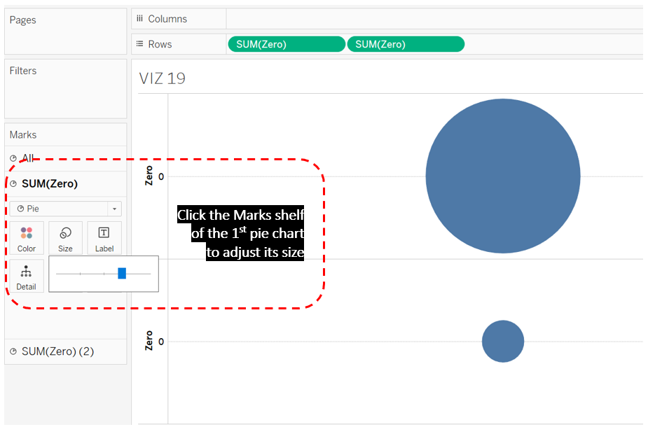
Step 6: Click the Marks shelf of the first pie chart and adjust the size of the pie chart so that it appears slightly larger than the second one.
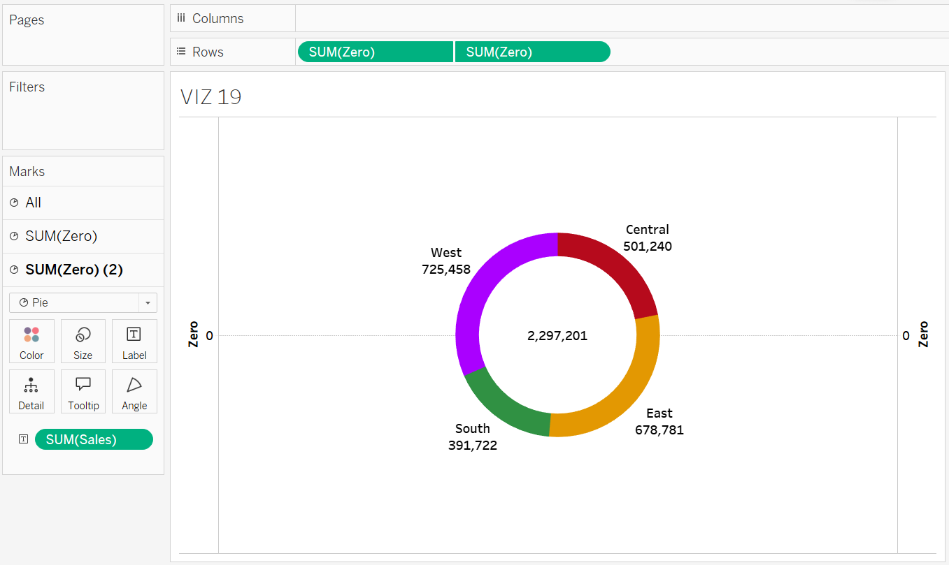
Step 7: In the same Marks shelf, drop the Region field to the Colour card, and the Sales field to the Size Card. At the same time, drop both Region and Sales to the Label Card.
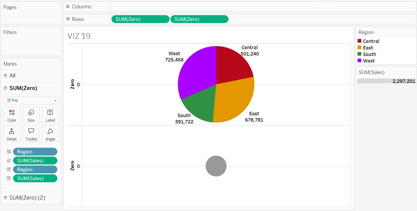
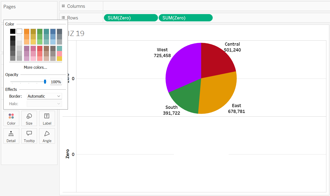
Step 8: Switch to the second Marks shelf and adjust the size of the second pie chart as needed, making sure it does not exceed the size of the first pie chart. Additionally, change the colour of the second pie chart to white using the Colour Card.
Step 9: Right-click the axis of the second pie chart. Choose Dual Axis to merge both pie charts.
Step 10 – Click on the Marks shelf of the second pie chart again. Then, drag the Sales field to the Label Card to show the figure in the centre.
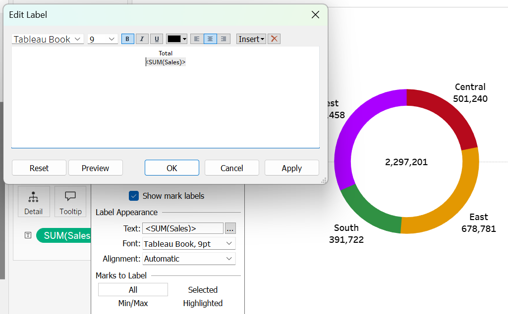
Step 11: Edit the Label to add the term “Total” before the sales figure.
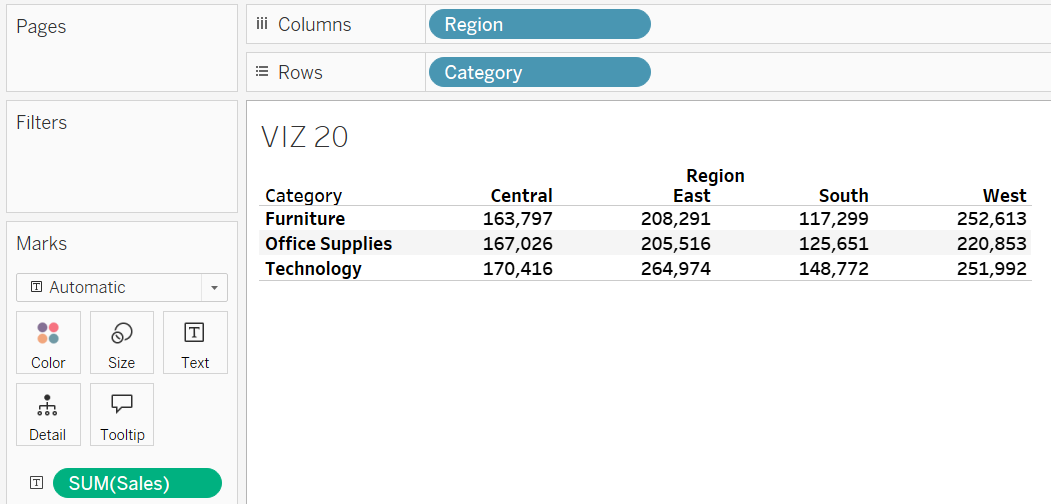
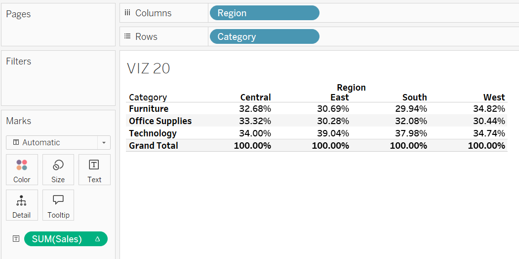
Crosstab
A crosstab, also known as a pivot table, is ideal for summarizing data across two dimensions. For example, it can be used to summarize sales by region and product category in a tabular format. Typically, the data in a crosstab is presented as percentages, which helps provide clearer insights into proportions and relative importance. Tableau offers functionality to enhance crosstabs by adding grand totals to columns or rows through the Total option in the Analysis menu. Additionally, you can easily convert the data into percentages relative to the column, row, or grand total using the Percentage Of feature also found under Analysis.
Exercise 24
Create a table that summarizes the sales data by region and product category. Name it VIZ 20. Arrange the regions as columns and the product categories as rows. Include a grand total for each region. Additionally, calculate the percentage of sales attributed to furniture items relative to the total sales in the Central region.
Solution – Exercise 24
Step 1: Place the Region field on the Columns shelf and the Category field on the Rows shelf. Drop the Sales field to the Label Card to create the crosstab. Rename the worksheet to VIZ 20.
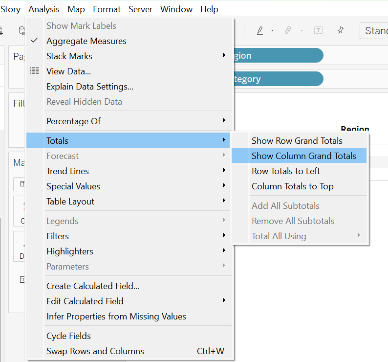
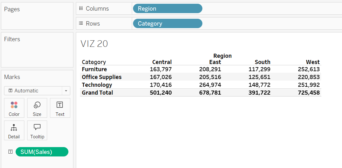
Step 2: In the toolbar, click on Analysis, select Totals, and then choose Show Column Grand Totals to display the total sales for each region.
Step 3: In the toolbar, click on Analysis, select Percentage Of, and then choose Column to convert the existing crosstab into a column-based percentage crosstab.
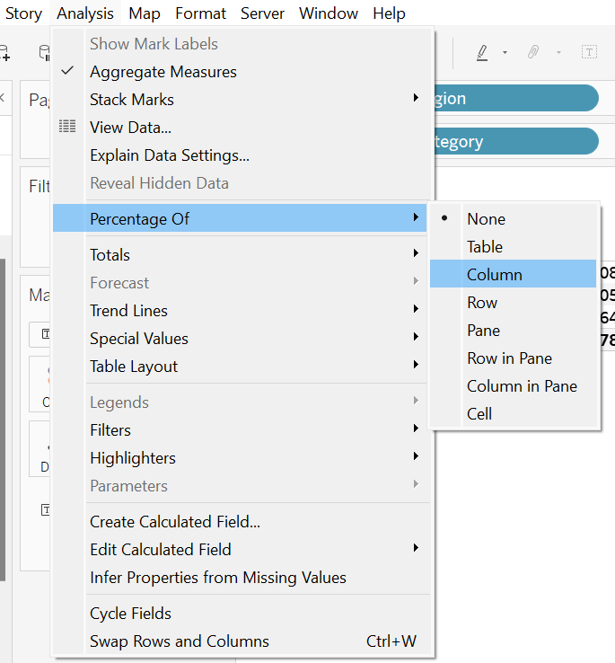
Step 4: Based on the percentage crosstab, we can conclude that 32.68% of the total sales in the Central region was contributed by furniture items.
Tree Map
A tree map is a visualization chart used to display hierarchical (tree-structured) data using nested rectangles. Each rectangle represents a category or subcategory, and the size and colour of the rectangles provide insights into the data.
Exercise 25
Generate a tree map displaying sales data by product categories and sub-categories. Rename the tree map to VIZ 21. What insights can you derive from the tree map?
Solution – Exercise 25
Step 1: Open a new worksheet and rename it VIZ 21. Click all three fields in the Data Pane section by holding the Ctrl button: Category, Sub-Category, and Sales.
Step 2: Under Show Me, choose the tree map icon.
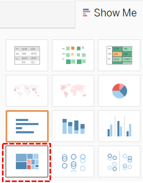
Step 3: Add the Category and Sub-Category fields onto the Label Card. From the treemap, it can be confirmed that phones generate the highest sales within the Technology product category compared to other technology items such as machines, copiers, or accessories. For the Furniture category, chairs lead in sales revenue, outperforming other products like tables, desks, or cabinets. It indicates that chairs are a major revenue driver in the Furniture category and may require focused inventory management and marketing efforts. In the Office Supplies category, storage solutions and binders generate the most revenue. This means that these items are the most essential products within Office Supplies, compared to other items like pens, notebooks, or office furniture.
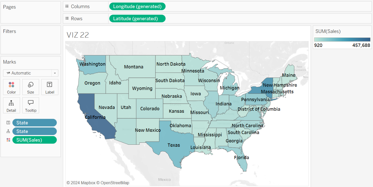
Geo Map
Geo maps let users visualize data with geographic components like districts, states or countries. They are great for showing geographic-based data like sales by region or population by city. By plotting data on a map, users can quickly spot patterns and differences between areas, such as which regions are performing well or growing fast. This helps with understanding regional trends and making strategic decisions. To create a proper geo map in Tableau, users will need at least one geographic field and one measure field.
Exercise 26
Build a geo map that shows sales data for each state. Rename the treemap to VIZ 21. Highlight the top 15 states with the highest sales figures.
Solution – Exercise 26
Step 1: Open a new worksheet and rename it to VIZ 22. Click the State and Sales fields simultaneously in the Data Pane, by holding the Ctrl button.
Step 2: Choose Maps under the Show Me menu.
Step 3 – Drop the State and Sales fields to the Label Card.
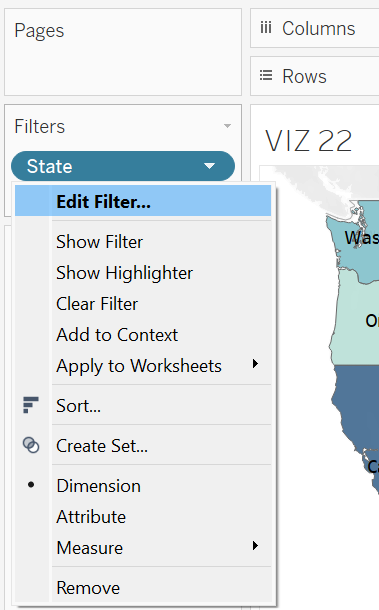
Step 4: Add the State field to the filter shelf. Click the down arrow next to the State field available in the Filters shelf and choose Edit Filter.
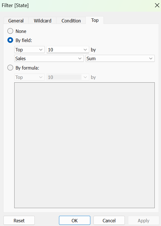
Step 5: Switch to the Top tab, choose By Field, and set the values according to the needs of the analysis.
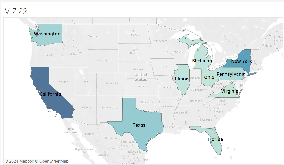
Step 6 – Clicking the OK button will update the geo map to display only the top ten countries by sales, with California in the lead and New York next.
Word Cloud
Word clouds are most effective for summarizing text data, where the size of each word corresponds to its frequency of occurrence in the dataset. They visually highlight the most frequently occurring words, making it easy to observe which terms are most significant or relevant. For example, feedback data collected from moviegoers can be converted into a word cloud, which may highlight keywords such as ‘action movies,’ ‘Korean cinema,’ ‘expensive tickets,’ and ‘online booking.’ These keywords can indicate current preferences or major issues encountered by moviegoers.
Exercise 27
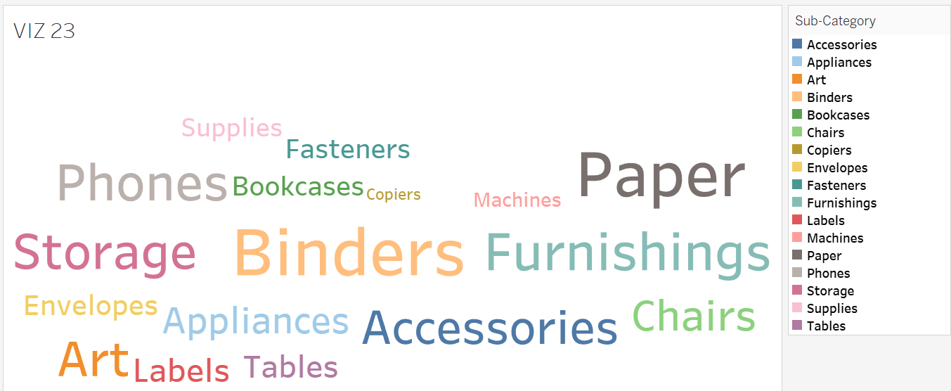
Create a word cloud to identify the most popular sub-category items based on the number of orders received. Name the word cloud VIZ 23.
Solution – Exercise 27
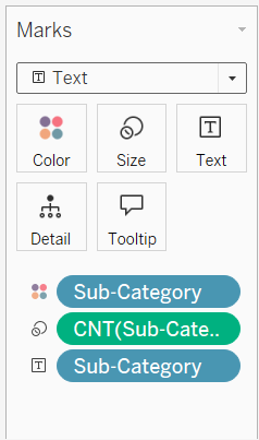
Step 1: Open a new worksheet and name it VIZ 23. Add the Sub-Category field to the Label, Colour, and Size Cards.
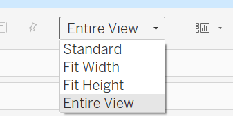
Step 2: Ensure the view mode on the toolbar is switched to Entire View.
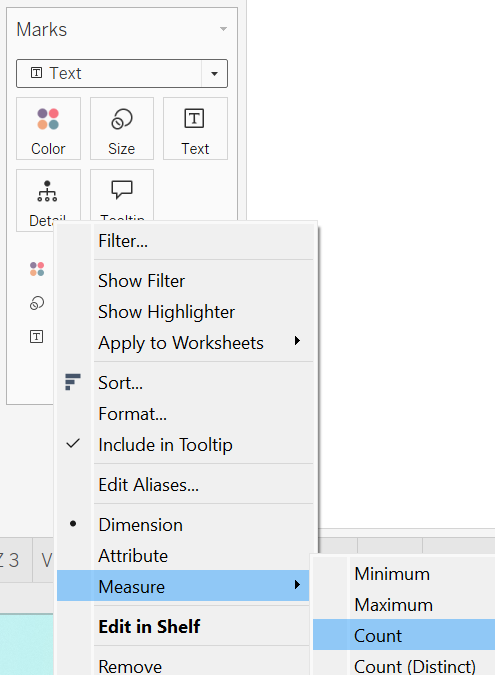
Step 3: Click the down arrow next to the Sub-Category field on the Size Card, then select Measure and choose Count. This action prompts Tableau to calculate the number of occurrences for each sub-category item, reflecting their total orders.
Step 4: The size of the items in the word cloud suggests that binders, furnishings, papers, phones, and storage are among the most popular sub-category items, receiving substantial orders.
Dual Graph
A dual graph enables users to overlay two different measures on the same axis, which is particularly helpful when comparing metrics with different scales. For instance, users may want to plot sales revenue and profit margin on the same axis within a chart, allowing them to compare both metrics to each other.
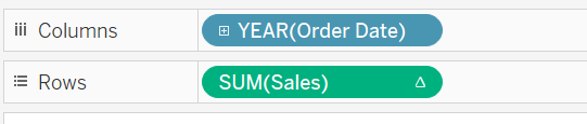
Exercise 28
Develop a dual graph to analyze both total sales and profit for each year, and title it VIZ 24. What conclusion can you draw from the dual graph?
Solution – Exercise 28
Step 1: Open a new worksheet and name it VIZ 24. Click the Order Date, Profit and Sales fields all together by holding the Ctrl button.
Step 2: Under Show Me, choose the Dual Graph option.
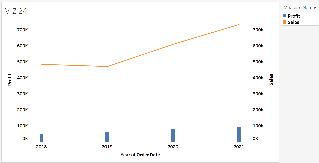
Step 3: Once generating the dual graph, users have the option to standardize both axes to the same scale for a more accurate comparison. To align both axes to a uniform scale, right-click on either axis and select Synchronize Axis.
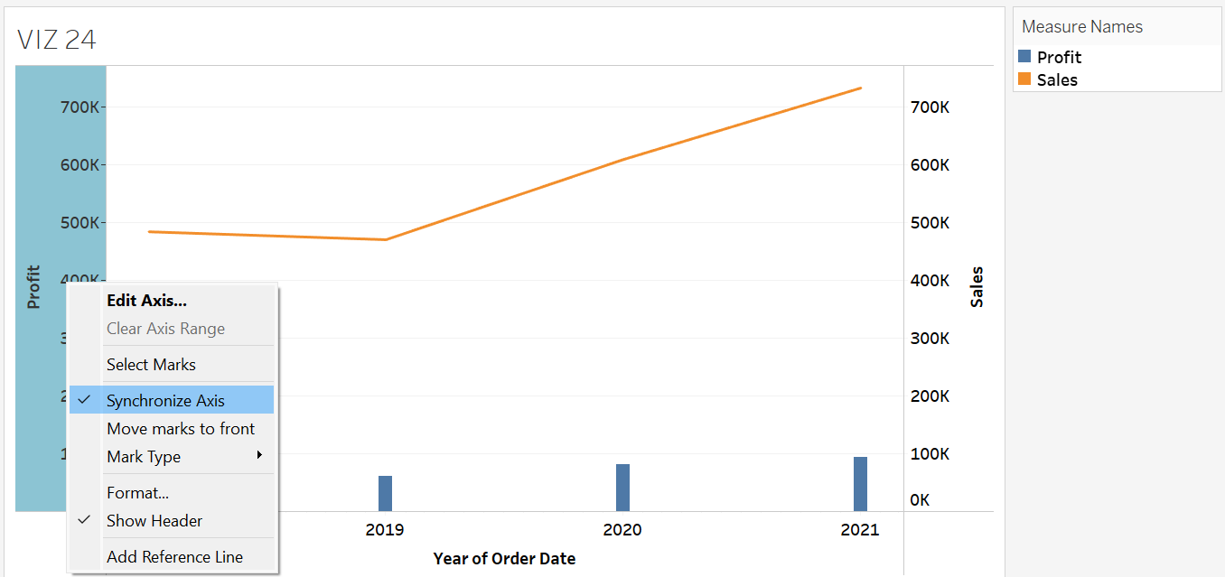
Step 4: The synchronized dual graph shows that both sales and profit have been rising consistently together since 2019.
Calendar Heatmap
A calendar heatmap is ideal for displaying data that has a daily component. For example, it can show daily sales figures, website usage rates, or customer activity over a month. Each day is represented as a cell, and colours indicate the magnitude of the data. By visualizing data in a calendar format, users can easily recognize seasonal trends and repeating patterns. For instance, users might witness increased sales during specific days of the week.
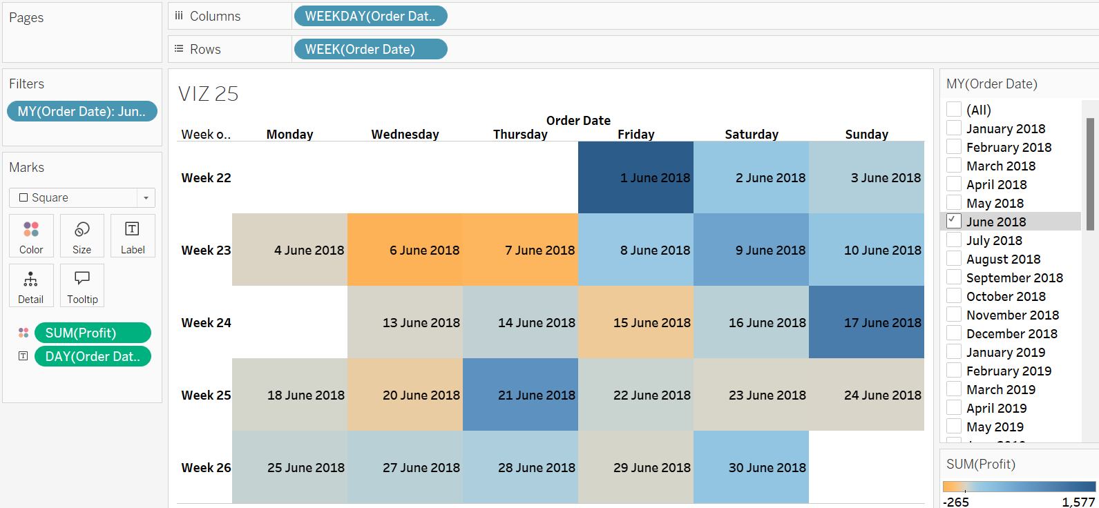
Exercise 29
Design a calendar heatmap to observe daily sales patterns across each month and year. Name it VIZ 25.
Solution – Exercise 29
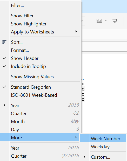
Step 1: Open a new worksheet and name it VIZ 25. Drag and drop the Order Date field onto the Columns shelf. Click the down arrow to choose More under the discrete date format section and choose Weekday to display days in the View.
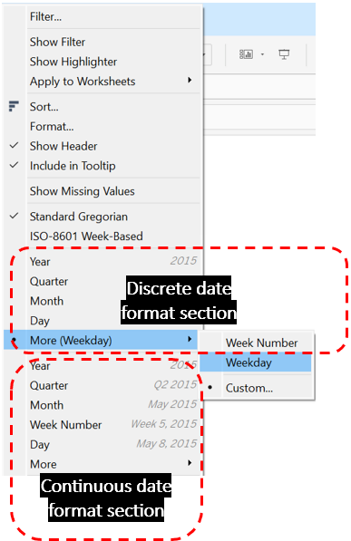
Step 2: Drag and drop the Order Date field onto the Rows shelf. Click the drop-down arrow, select More under the discrete date format section, and choose Week Number to display the number of weeks in the View.
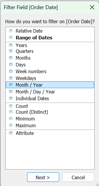
Step 4: Drop the Order Date field to the Filters shelf and choose Month/Year to allow the users to control the data in the View according to month and year.
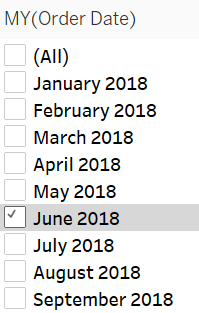
Step 5: Display the filter card, and randomly pick any one option. For example, in this case, choose April 2018.
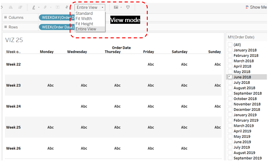
Step 6: Ensure that the view mode in the toolbar is set to Entire View.
Step 7: Drop the Profit field to the Colour card.
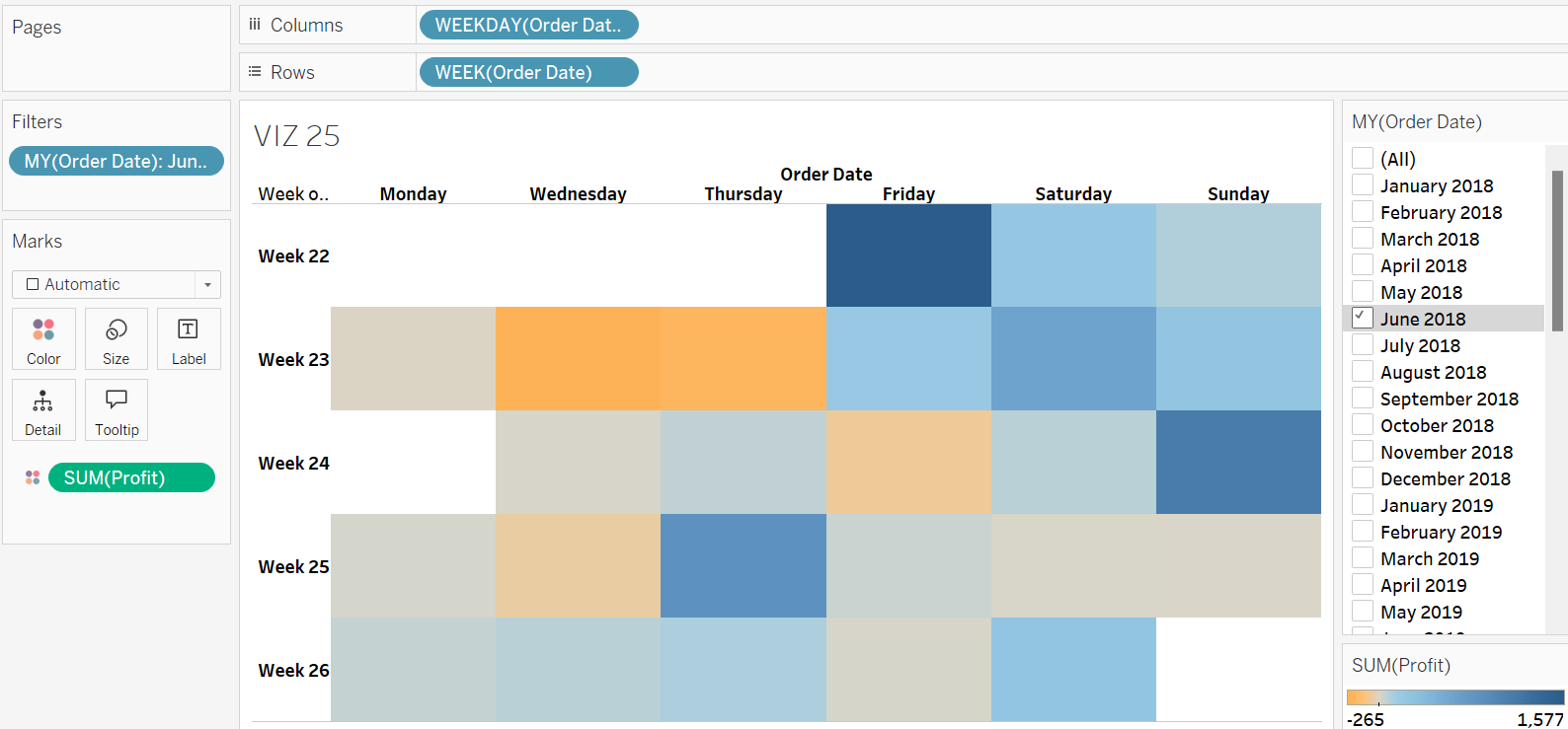
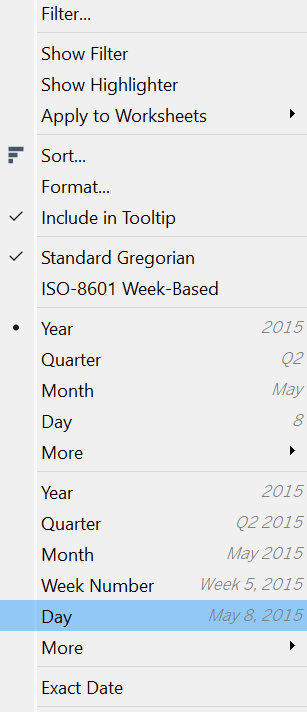
Step 8: Drop the Order Date field to the Label Card. Click the down arrow next to the Order Date field and change the date format to Day to display the exact date information in the calendar.
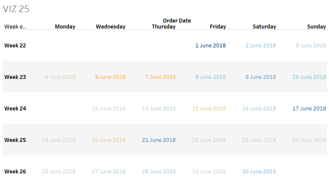
Step 9: Switch the type of the marks to Square to obtain the final calendar heatmap.
Step 10: Users can use the filter card to navigate between different months and analyze the daily profit trends.
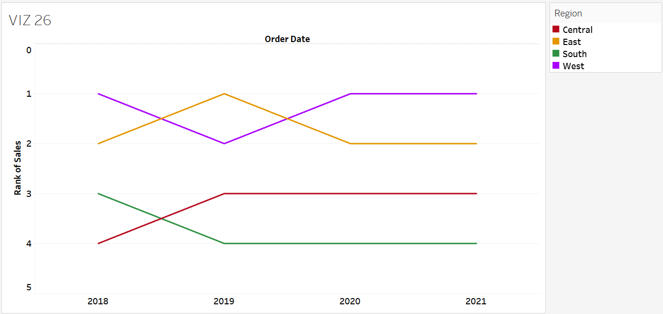
Bump Chart
Bump charts are ideal to observe how the rank of various dimension items e.g., the product categories, sales teams, or regions changes, changes across different time points. For example, we can monitor the rankings of different sales teams by their monthly performance, showing which teams have developed or declined in rank.
Exercise 30
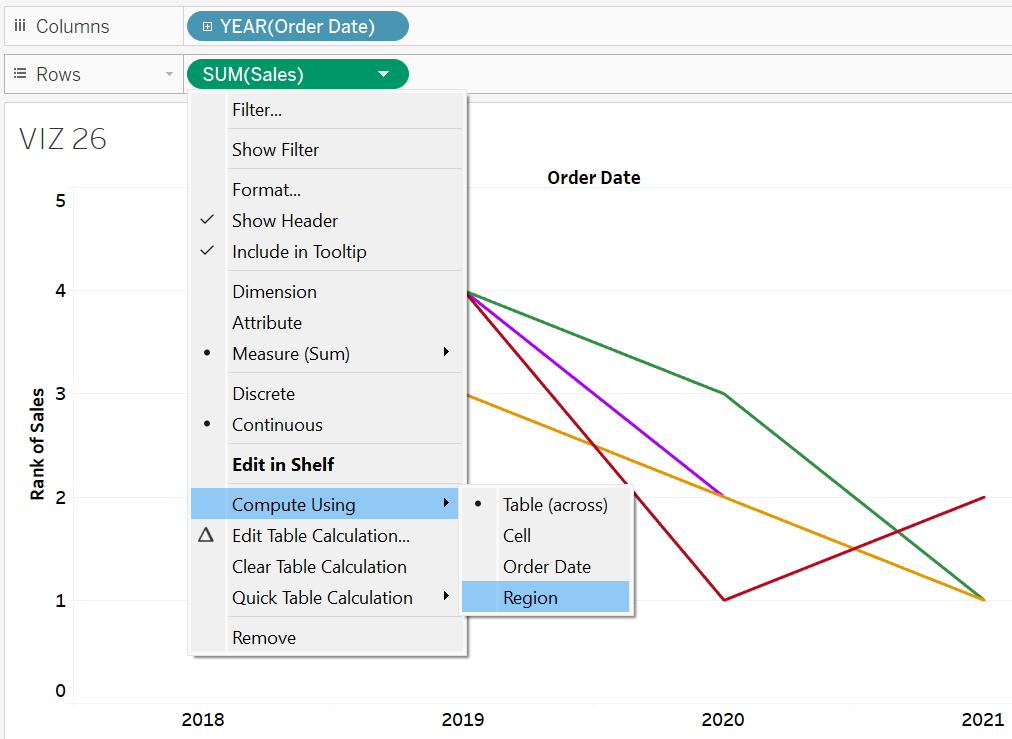
Build a bump chart to compare the ranks of different regions in terms of their yearly sales. Name the chart VIZ 26. What insights can you offer based on the bump chart?
Solution – Exercise 30
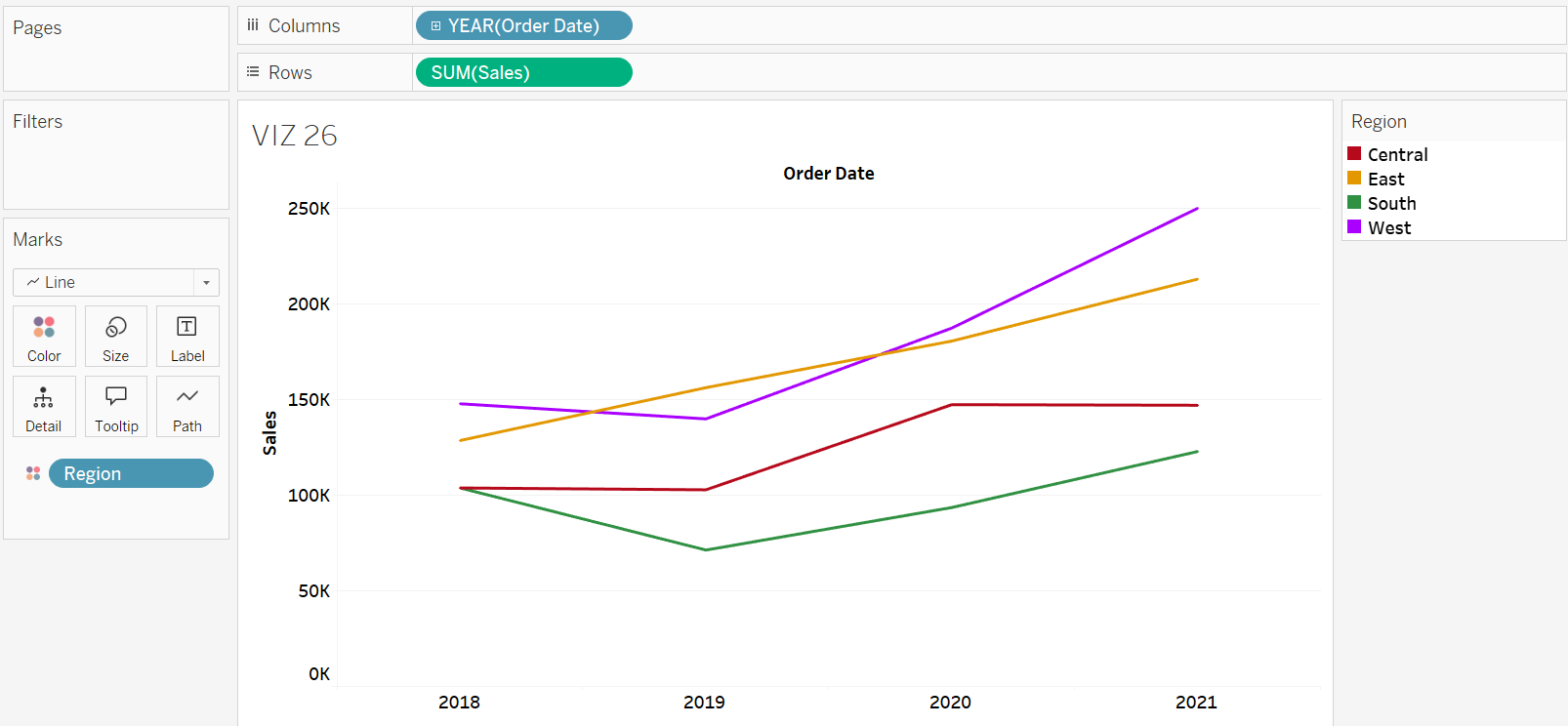
Step 1: Create a new worksheet and name it VIZ 26. Next, drag the Order Date field onto the Columns shelf and the Sales field onto the Rows shelf.
Step 2: Drop the Region field to the Colour card.
Step 3: The axis must be converted to rank values. To do this, click the down arrow next to the Sales field in the Rows shelf. Then, select Quick Table Calculation and choose Rank.
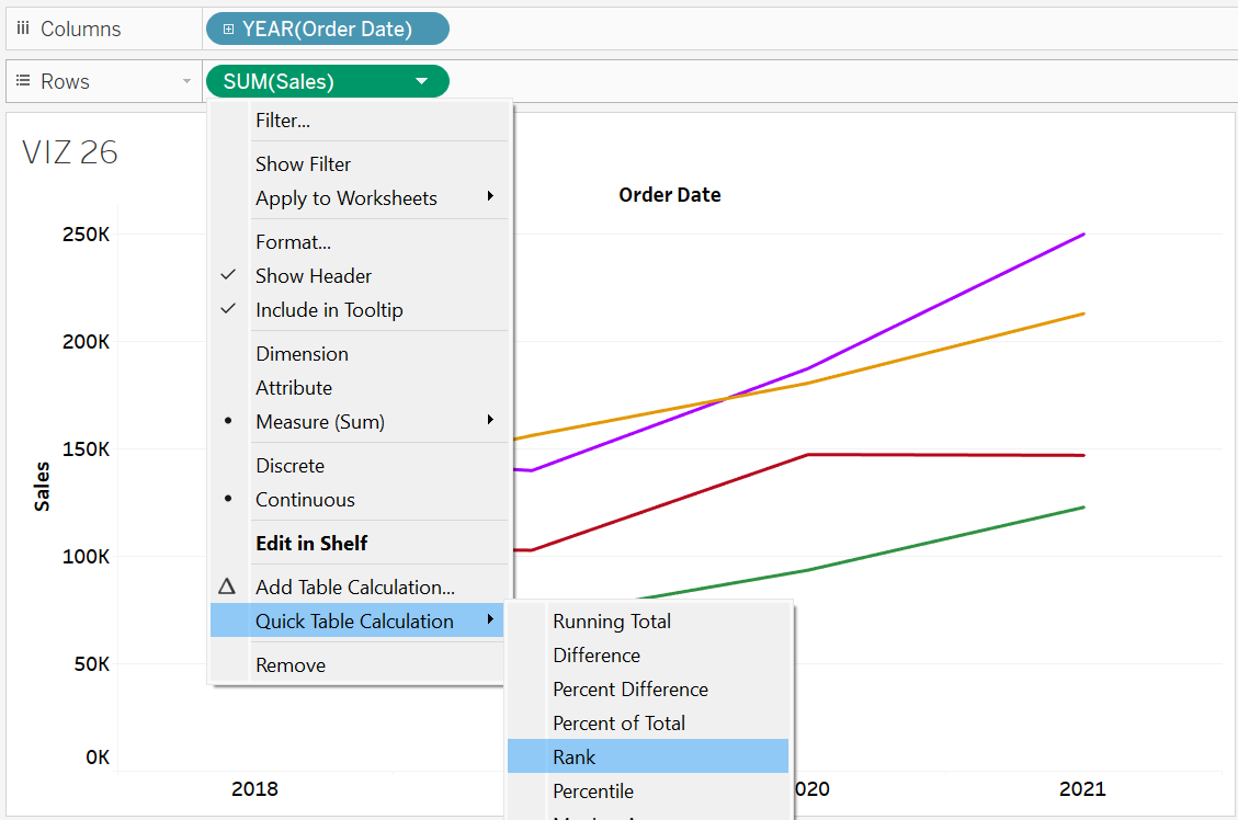
Step 4: The ranks within each year should be calculated based on the regions. To do this, click the down arrow next to the Sales field in the Rows shelf. Then, hover over Compute Using and select Region.
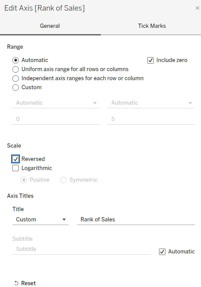
Step 5: The current version of the bump chart displays regions with a better rank appearing lower on the chart, while those with a poorer rank appear higher. To have regions with a better rank appear at the top of the chart, you need to reverse the scale on the axis. To do this, right-click the axis, select Edit Axis, and then, in the Edit Axis settings, check the Reversed option under the Scale section.
Step 6: The bump chart clearly shows that from 2018 to 2021, the West and East regions consistently held the 1st or 2nd ranks. In contrast, the Central and South regions remained the lowest performers, struggling to surpass the top two regions.