5 CALCULATIONS IN TABLEAU
|
|
By the end of this chapter, readers will be able to:
|

Quick Calculation Table
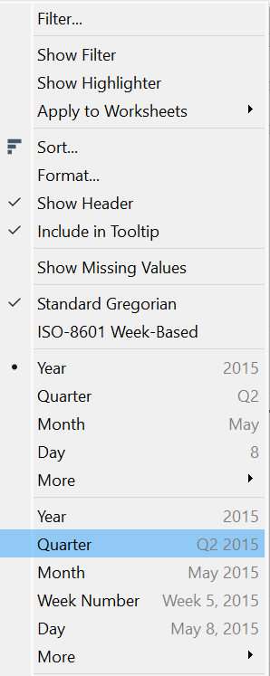
In Tableau, the Quick Calculation Table feature offers a convenient way to perform common calculations immediately without the need to write complex formulas manually. Quick Calculation Table can be accessed by clicking the down arrow next to each field available in the Data Pane. When users choose the Quick Calculation Table, a list of common calculations that users may want to apply to the selected field appears. These calculations include:
- Percent of Total: Calculates the percentage of each value in the selected field relative to the total.
- Running Total: Computes the cumulative total of the values in the selected field.
- Difference: Calculates the difference between consecutive values in the selected field.
- Percent Difference: Computes the percentage difference between consecutive values in the selected field.
- Rank: Assigns a rank to each value in the selected field based on specified criteria.
Exercise 18
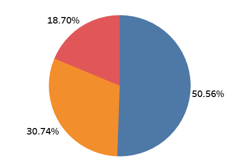
Create a pie chart showing the total percentage of sales contributed by each segment of customers. Rename the chart to VIZ 13. What is the total percentage of sales contributed by the home office segment?
Solution – Exercise 18
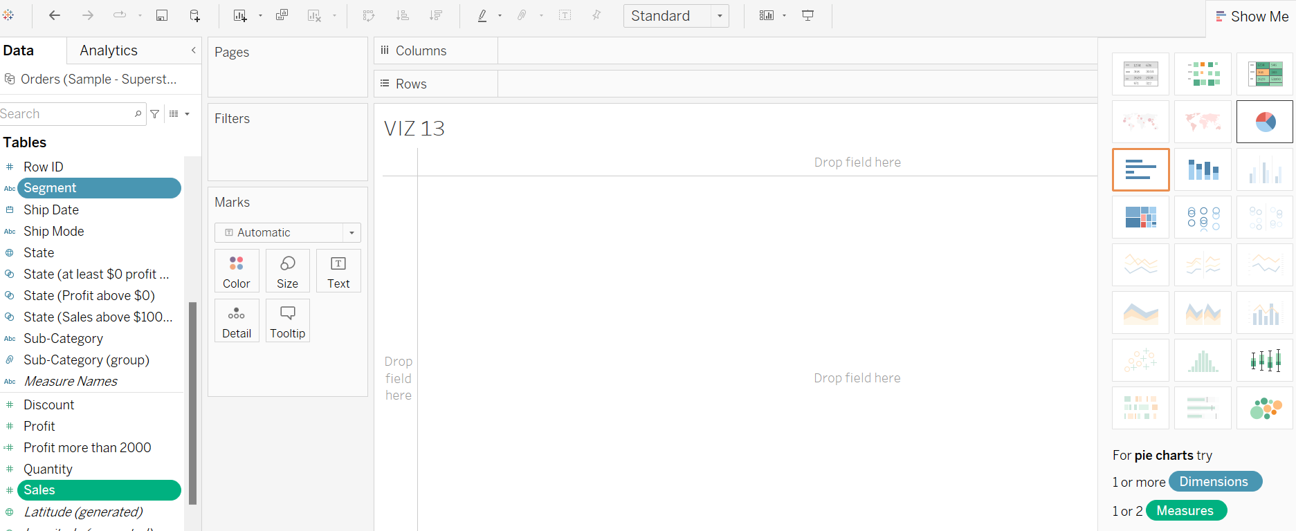
Step 1: Open a new worksheet and rename it to VIZ 13. Click both the Segment and Sales fields in the Data Pane by holding the Ctrl button. Under Show Me, choose the Pie Chart icon.
Step 2: Name the pie chart VIZ 13. Drag and drop the Sales field to the Label Card to add total sales information to the pie chart.
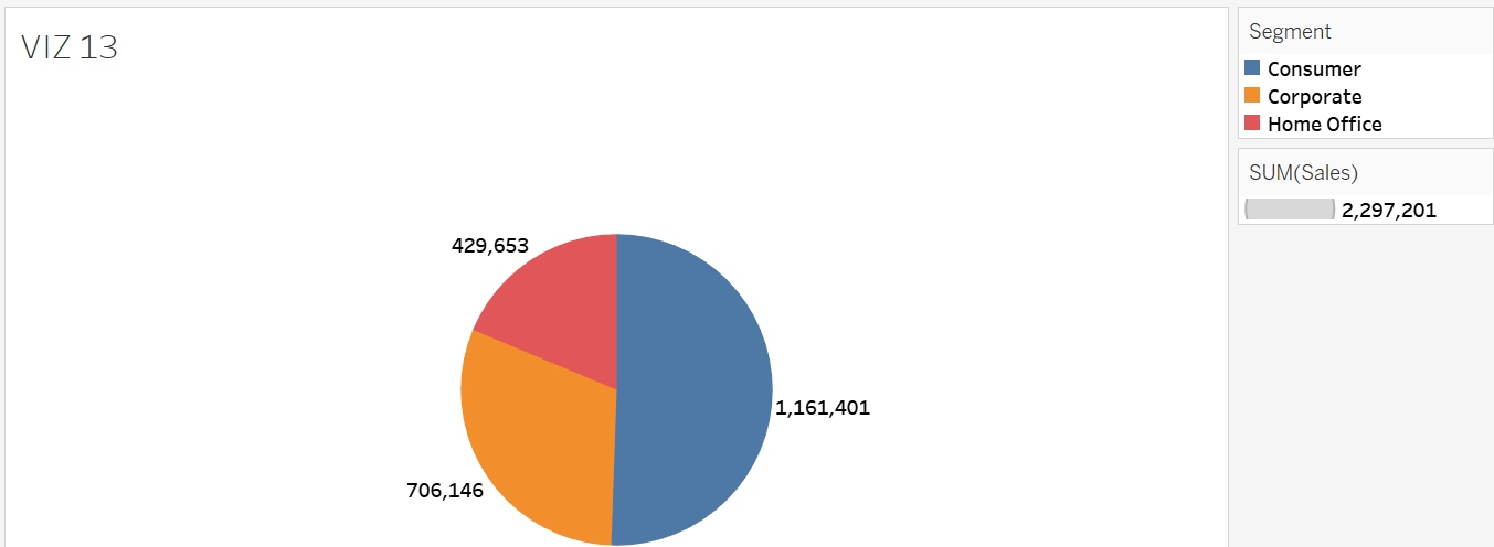
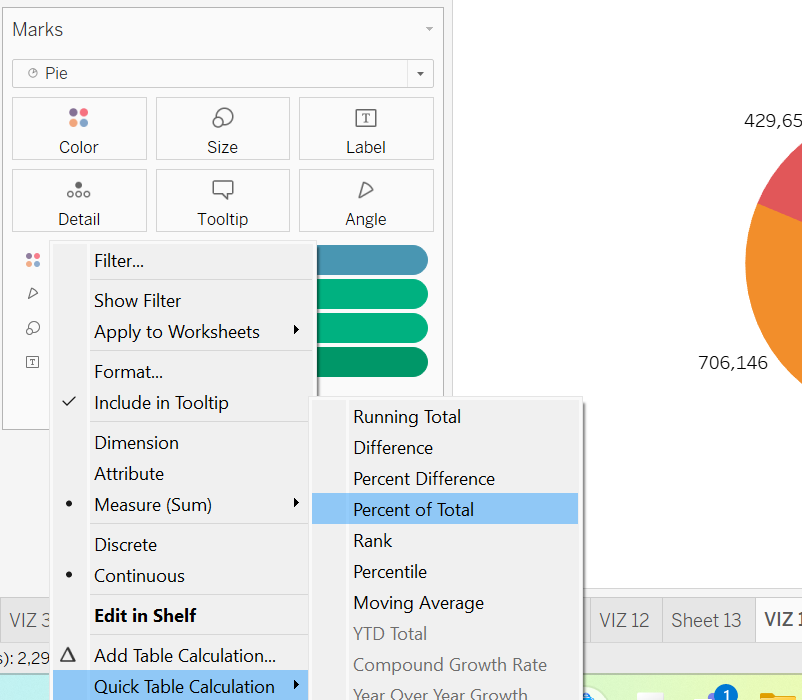
Step 3: Click the down arrow next to the Sales field added to Label Card, choose Quick Table Calculation, and pick Percent of Total.
Step 4: The pie chart now shows the percentage of sales for each segment relative to total sales. It is clear that the home office segment accounted for just 18.70% of the overall sales.
Exercise 19
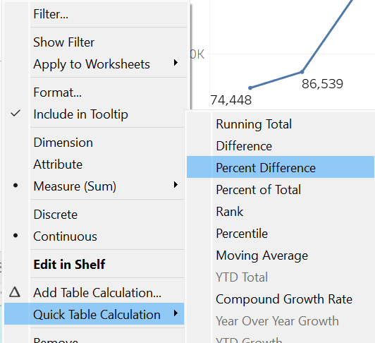
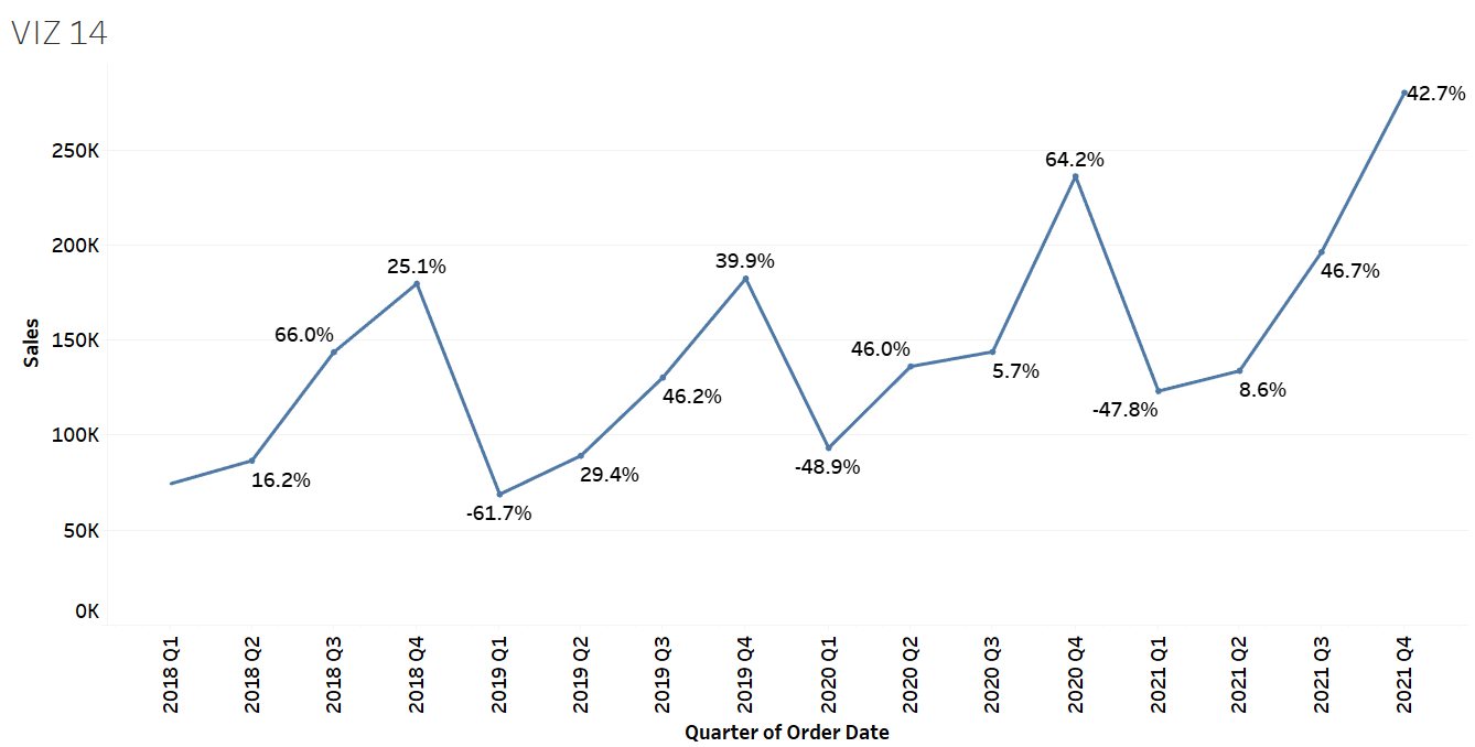
Generate a line chart illustrating sales by quarter per year and name it VIZ 14. Apply the Percentage Difference available in the Quick Table Calculation to determine which quarter and year experienced a significant decrease in sales compared to the preceding period, and indicate the percentage of the decline.
Solution – Exercise 19
Step 1: Add Order Date to the Columns shelf and Sales to the Rows shelf, then rename the worksheet to VIZ 14. Click the down arrow next to the Order Date field available on the Columns shelf. Switch the Order Date format from Year to Quarter & Year. As the Order Date is now set as a continuous field, a line chart (not a bar graph) will automatically display.
Step 2: Add Sales to the Label Card. Click the down arrow next to the added Sales field, choose Quick Table Calculation, and then select Percent Difference.
Step 3: The line chart now displays the percentage change in sales for each quarter of the year compared to the previous time point. It indicates a significant decline in sales during Q1 2019, with a decrease of -61.7% from the prior quarter.
Exercise 20
Using the Quick Calculation Table, find the rank of bookcases among the other sub-categories in terms of total profit earned.
Solution – Exercise 20
Step 1: Create a bar graph showing the total profit vs. sub-categories. Name it VIZ 15. Drop the Profit field to the Label Card.
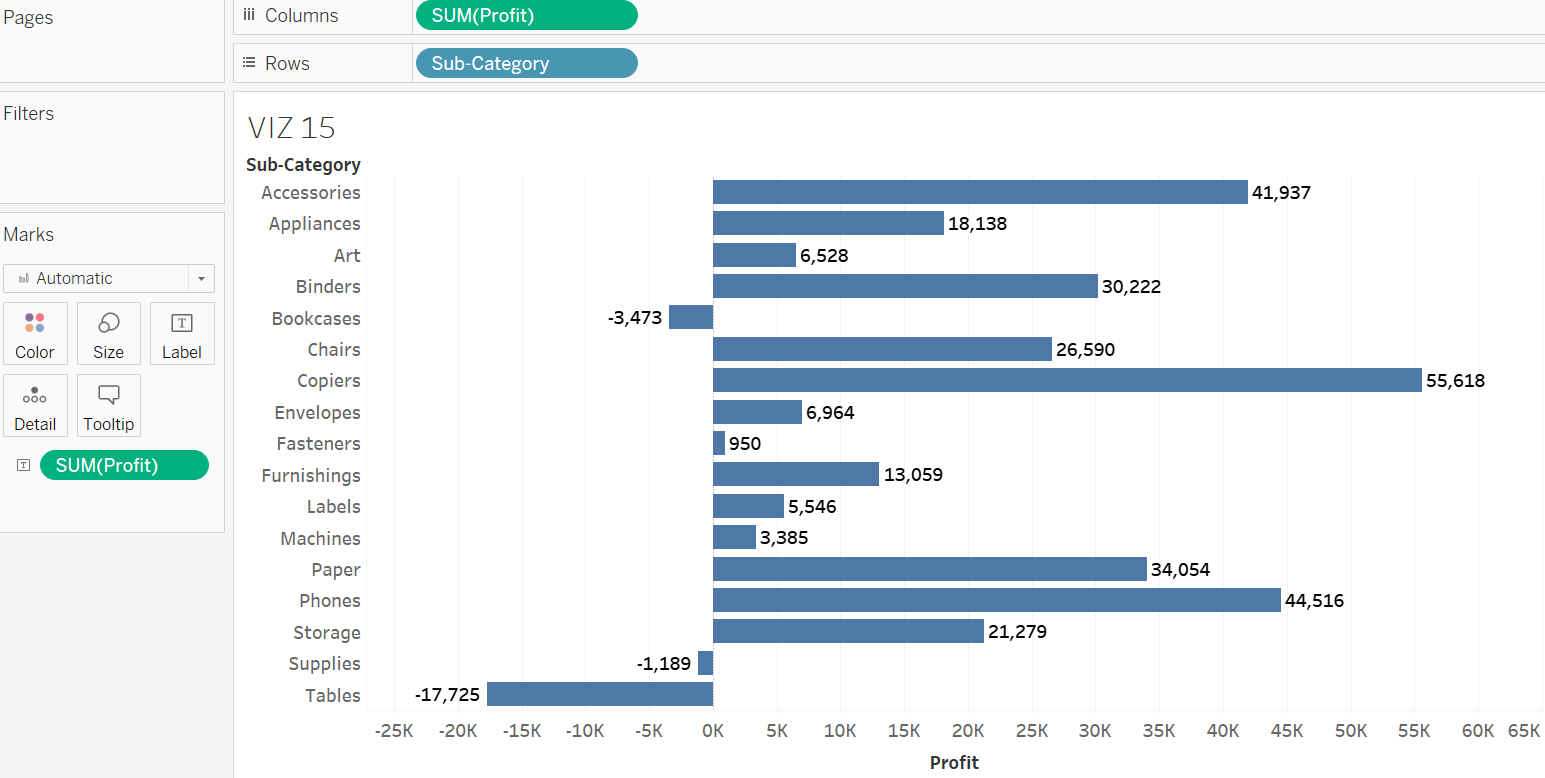
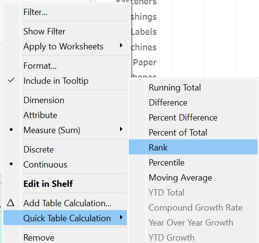
Step 2: Click the down arrow next to the Sales field on Label Card, choose the Quick Table Calculation, and then select Rank.
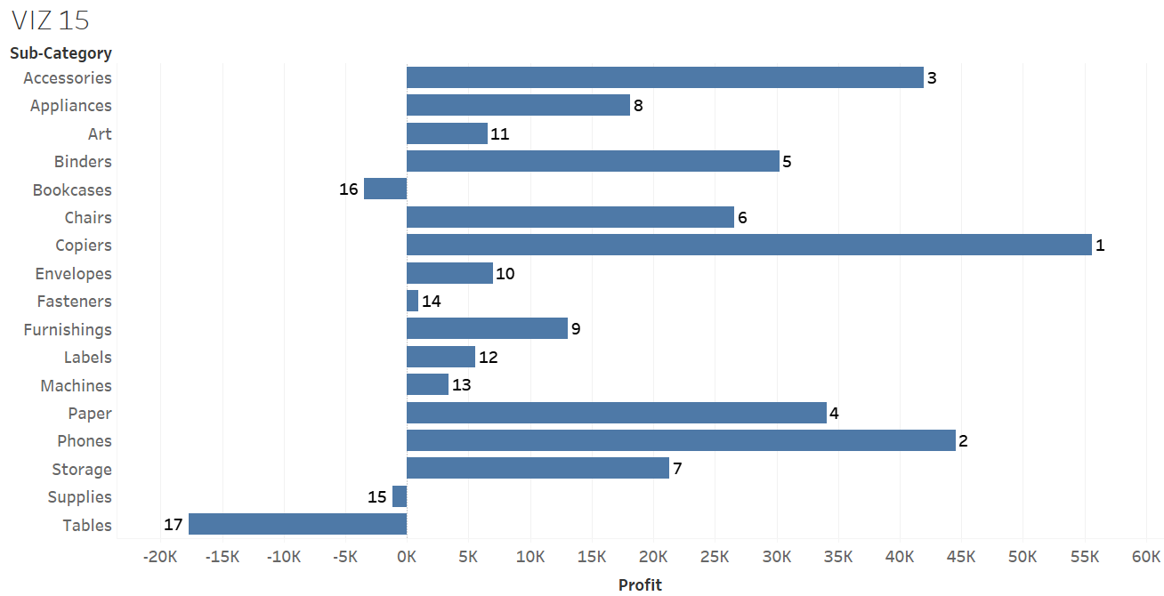
Step 3: The bar graph displays the rank of each sub-category item. Based on the bar graph, bookcases ranked at the 16th position in terms of profitability.
Calculated Fields
Tableau users have the option to process the current data within a data source to generate a new field, which may be necessary for further analysis. This new field, known as a calculated field, can be created using various mathematical functions available in Tableau. These functions fall into several categories, including basic arithmetic, statistical, logical, date, and string functions.
Exercise 21
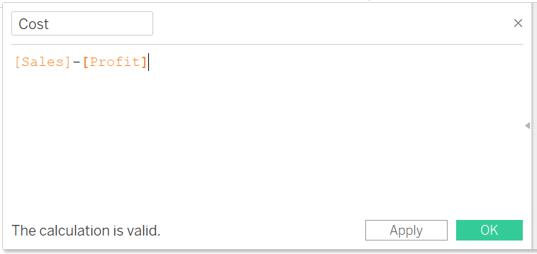
Create a calculated field using the existing data to represent the cost for each order. Note that, cost = sales – profit. Construct a bar chart to display the average cost per sub-category. Which sub-category item has the largest average cost?
Solution – Exercise 21
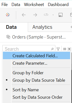
Step 1: Click the down arrow at the top right corner of the Data Pane and choose Create Calculated Field.
Step 2: Name the new field Cost, and enter the needed formula in the available calculation space. Note that the fields required in the formula appear as we type them. Tableau alerts us if the entered formula is invalid either because of illogical calculations or if its expression does not meet Tableau’s calculation language.
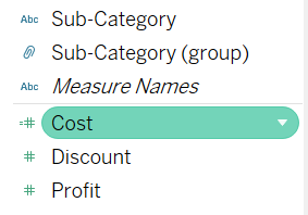
Step 3: Once clicking OK, the newly created calculated will appear in the Data Pane.
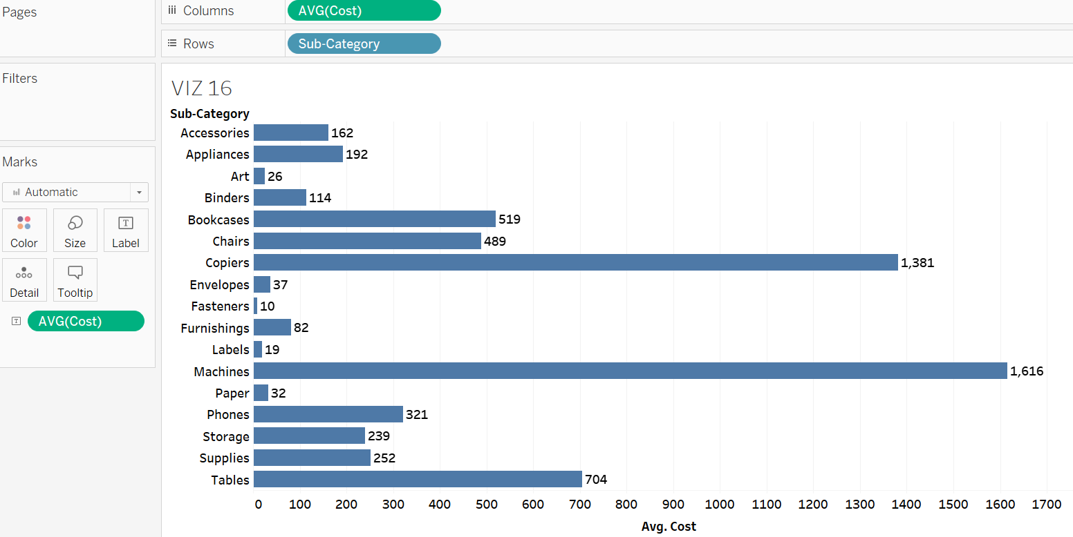
Step 4: To create the cost vs. sub-category graph, drag and drop the Cost and Sub-Category fields onto the Columns and Rows shelf, respectively. Name it VIZ 16. Change the aggregation type of cost from sum to average. Also, drop the Cost field to the Label Card and ensure the aggregation is set to average. The graph points out machine has the highest average cost with $1616, followed by copiers, and Tables.
Exercise 22
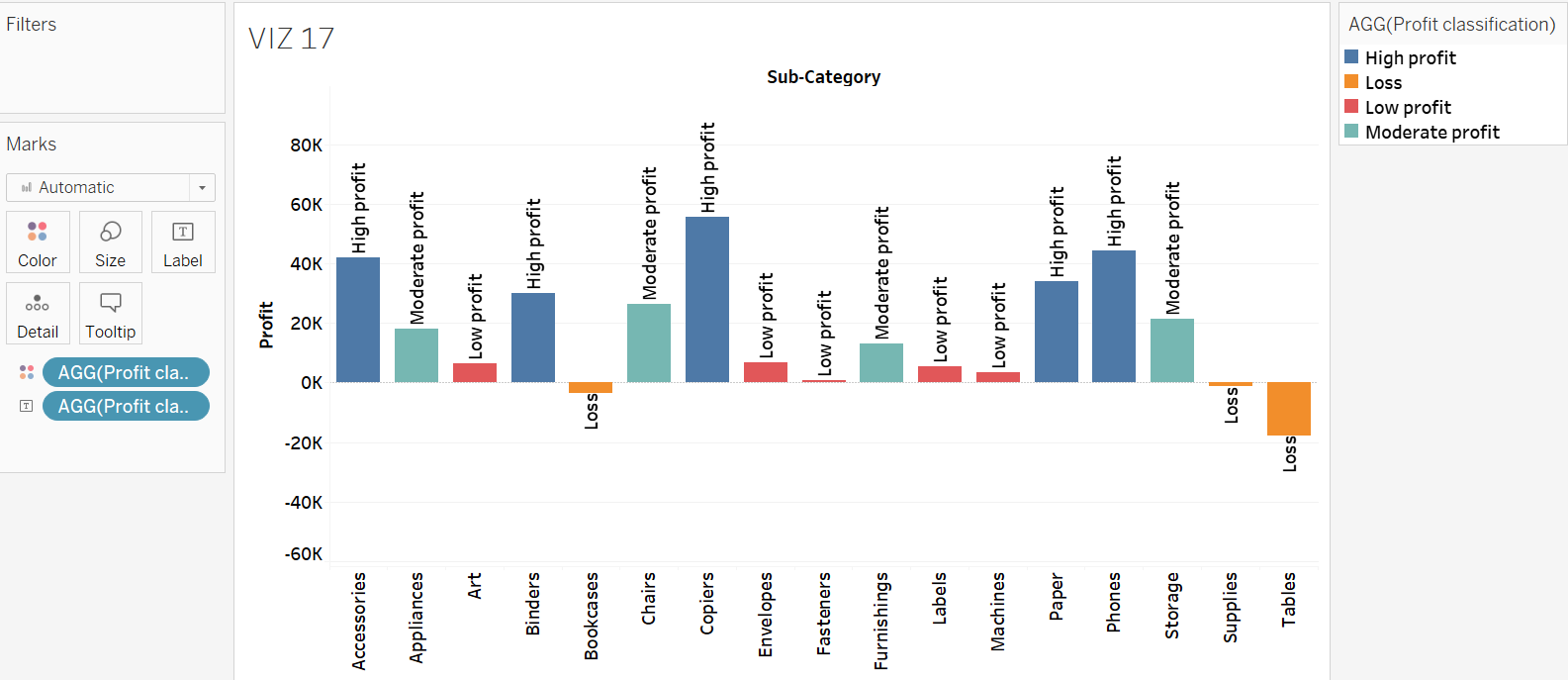
Create a calculated field to classify the sub-category items as “High profit”, “Moderate profit”, “Low profit”, and “Loss”. Apply the conditions listed in the following table for the classification. Also, generate a chart depicting the total profit versus sub-category, and integrate the classification information into the chart. What are the sub-category items that are classified as “Loss” items?
|
Classification |
Condition |
|
High profit |
Total profit is $30,000 and above. |
|
Moderate profit |
Total profit is $10,000 and above. |
|
Low profit |
Total profit is $0 and above. |
|
Loss |
Total profit is below $0. |
Solution – Exercise 22
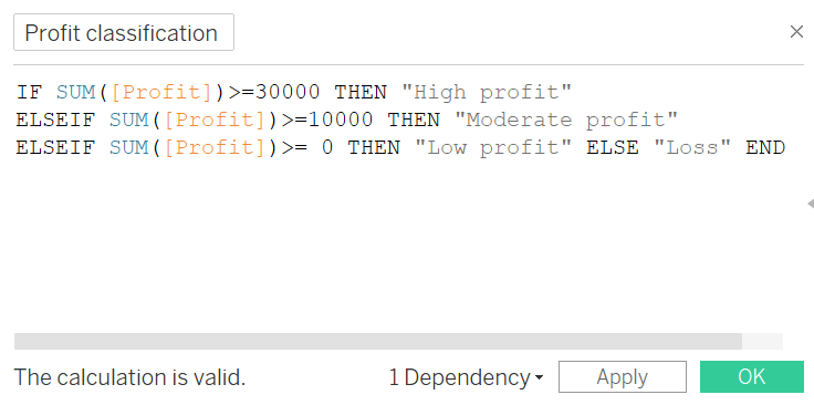
Step 1: Create a calculated field using the logical functions, e.g., IF, THEN, and ELSE, to classify the sub-category items based on the conditions given. Name the field Profit Classification.
Step 2: Open a new worksheet and rename it to VIZ 17. Construct a bar graph depicting the total profit versus sub-category.
Step 3: Drag and drop the Profit Classification field to the Colour and Label Cards to distinguish each sub-category according to its classification. The chart tells that bookcases, supplies, and tables are three sub-category items classified as “Loss”.