2 CUSTOMIZING VISUALIZATIONS
|
|
By the end of this chapter, readers will be able to:
|

Colour Card
Colours play a crucial role in data visualization. They are not only used to enhance the appearance of a visualisation but more importantly to differentiate the marks according to dimension members or to indicate the value of a dimension member.
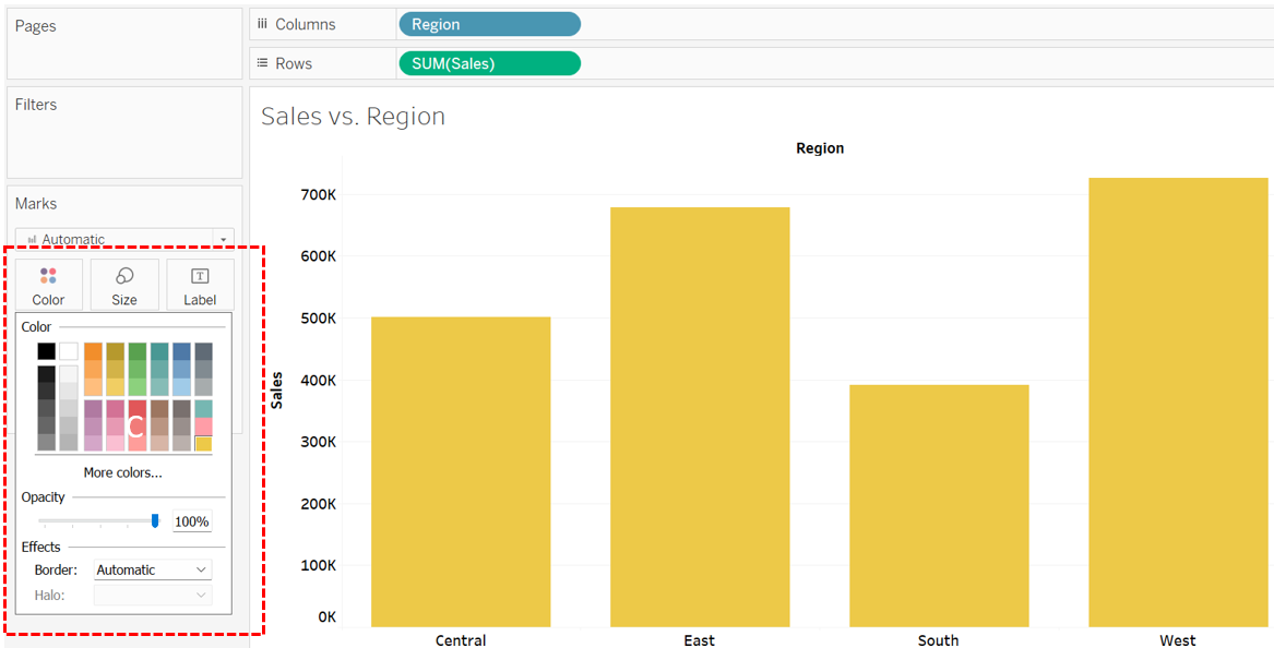
In Tableau, the colour of marks can be customized by dragging a field to the Colour Card located on the Marks shelf. Following are some interesting facts about the Colour Card:
- Users have the option to modify the default colour of all marks within a visualization at once. For example, click the Colour Card in VIZ 1 to switch the colour of the marks from blue to yellow.
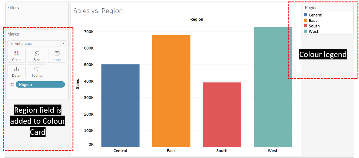
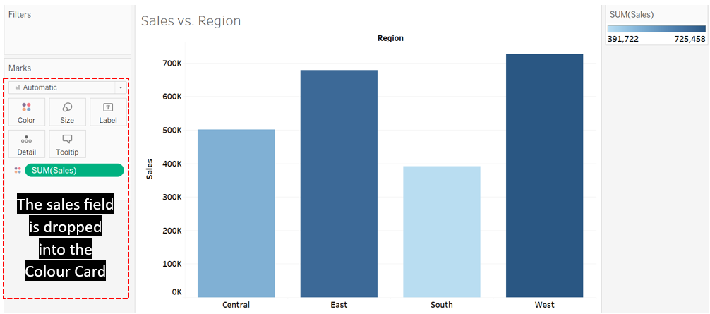
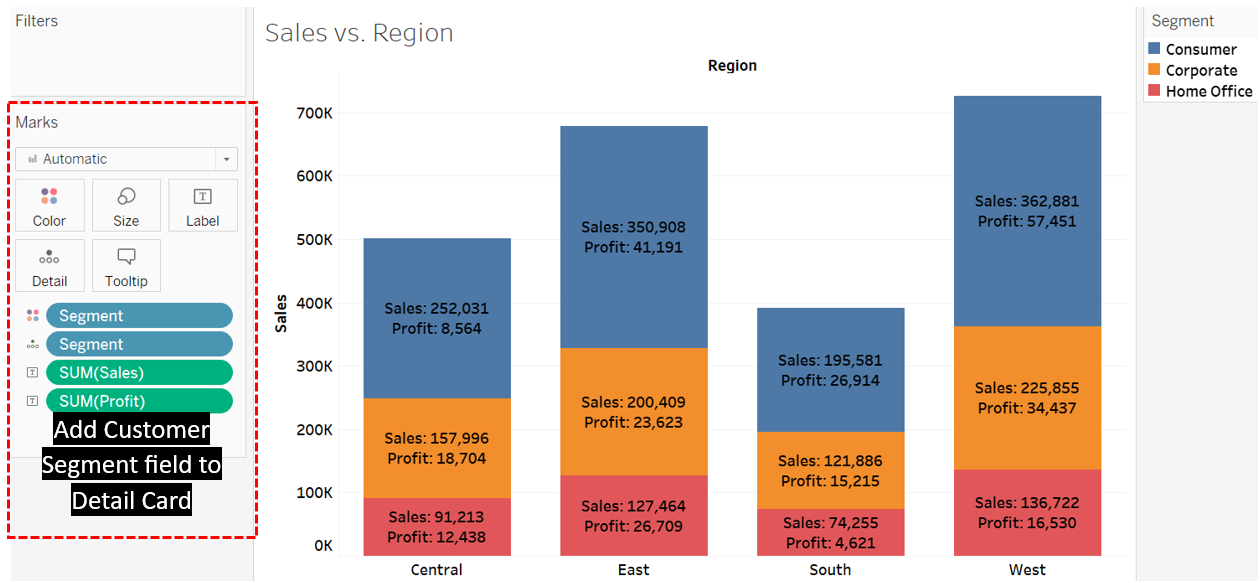
- Different colour codes can be assigned to items within a dimension field by dragging the field to the Colour card. Tableau utilizes an appropriate colour palette to distinguish between the dimension items. For example, dragging the region field to the Colour card in VIZ 1 will assign a different colour to each region. When a dimension field like the region is added to the Colour card, a colour legend is automatically included in the View.
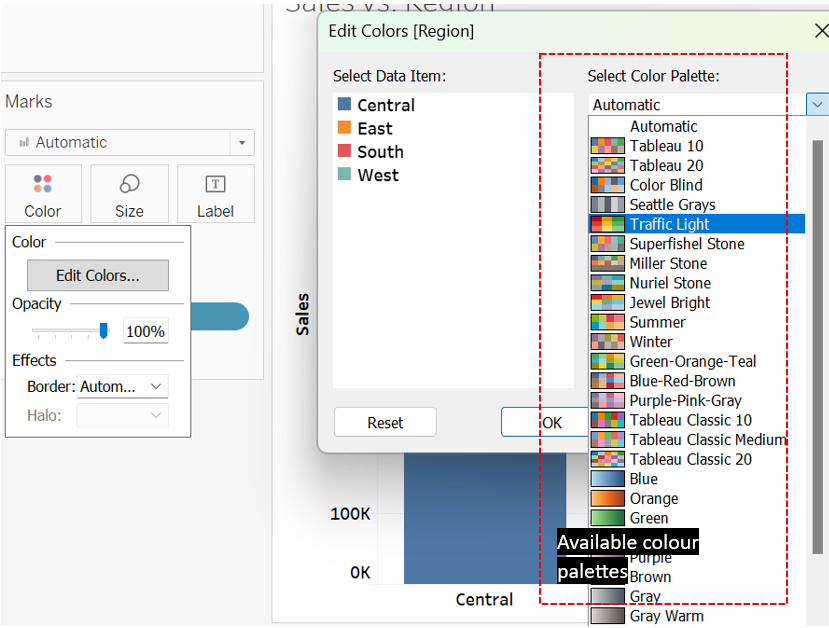
- Users have the option to replace the automatically assigned colour palette with another by using the Edit Colours feature, which appears upon clicking the Colour card. Tableau provides a range of colour palettes to choose from. Simply select the preferred colour palette to replace the existing one, and click Assign Palette, followed by Apply. The following figure is the screenshot capturing the process of changing the existing colour palette in VIZ 1 to the Traffic Light option. Note that users can also change specific colours of a palette once it is applied to a visualization.
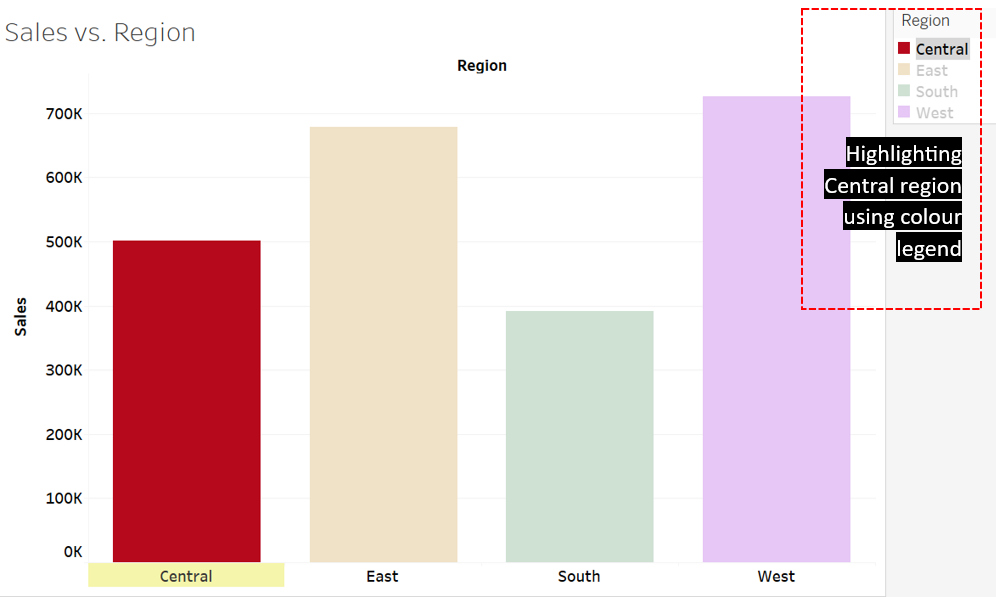
- The colour legend can serve as an alternative highlighter, directing the audience’s focus to specific selected marks within a visualization. For instance, clicking Central on the colour legend in VIZ 1 causes the other marks in the visualization to appear faded in comparison to the highlighted Central.
- Instead of using a colour palette, Tableau automatically assigns sequential or diverging colours to dimension items when a measure field is added to the Colour card. The sequential colour uses a specific colour as a base and the darkness of the colour changes based on the data value of each item. Typically, darker colours indicate higher values, but this can also be reversed using the Edit Colour option that appears when the Colour card is clicked. Diverging colours serve a similar purpose, but they have two base colours. They are suitable for a field that has both negative and positive values, with one colour representing negative values and the other representing positive values. Below is VIZ 1, where sequential colours are applied, representing the sales value of each region. The darkest blue is attributed to the West region, which has the highest sales, while the lightest blue corresponds to the South region, reflecting its lowest sales.
Size Card
In Tableau, users can adjust the size of marks according to the needs of the analysis. Sizing enables easy comparison between dimension items and sometimes may help reveal intriguing relationships within the data. Mark size adjustments can be made using the Size Card located on the Marks shelf. Here are some interesting details about the Size Card:
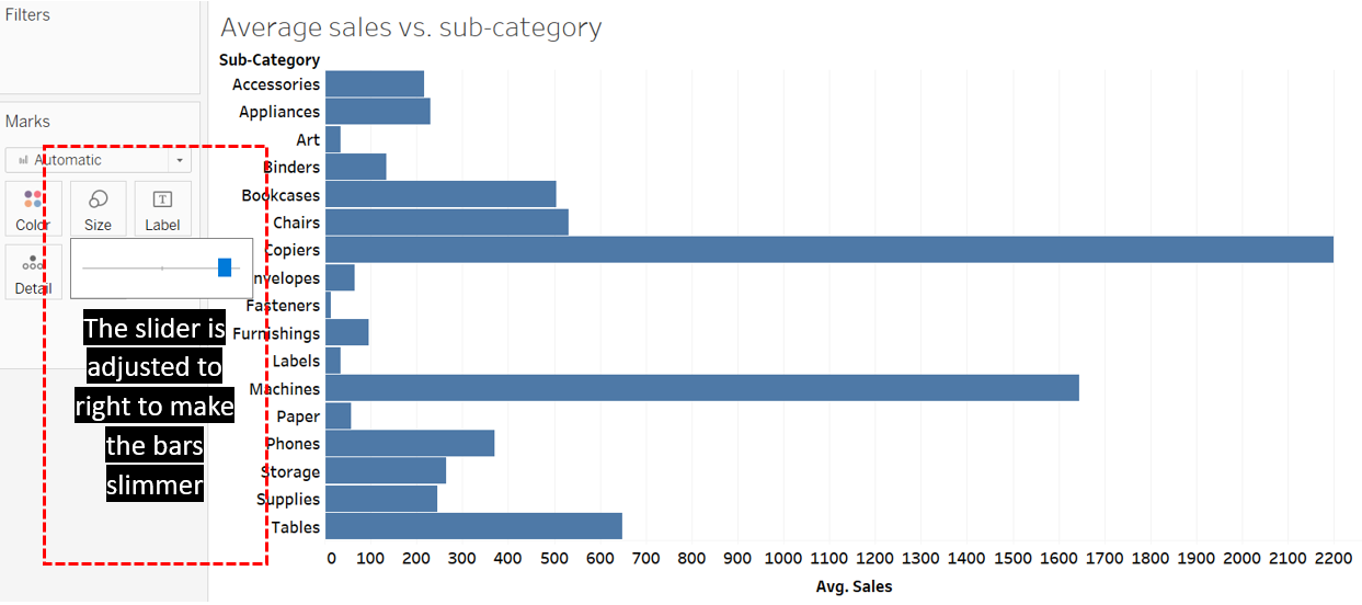
- Users can enlarge or shrink marks within the visualization using the slider that pops up once the Size Card is clicked. For example, use the size slider to make the bars in VIZ 3 broader.
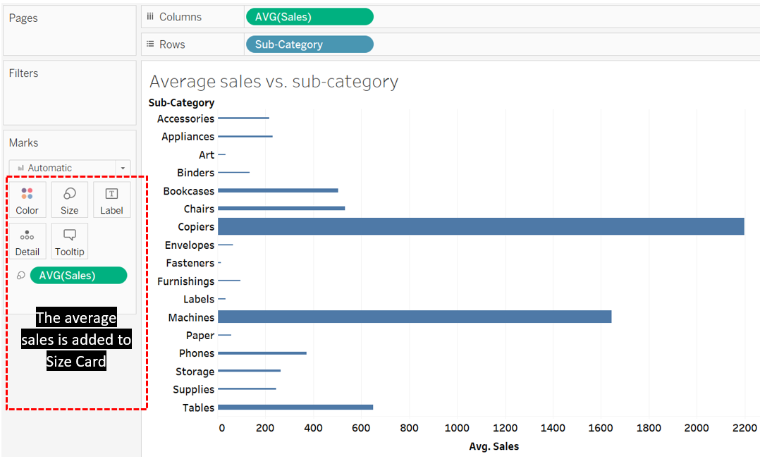
- Users have the option to customize the size of marks based on the values of a field. For instance, in VIZ 3, the height of the bars signifies the sales value of each region, while the width of the bars remains consistent. However, by including the average sales in the Size Card, akin to the adjustment made for the bar height, the width can also be aligned with sales values.
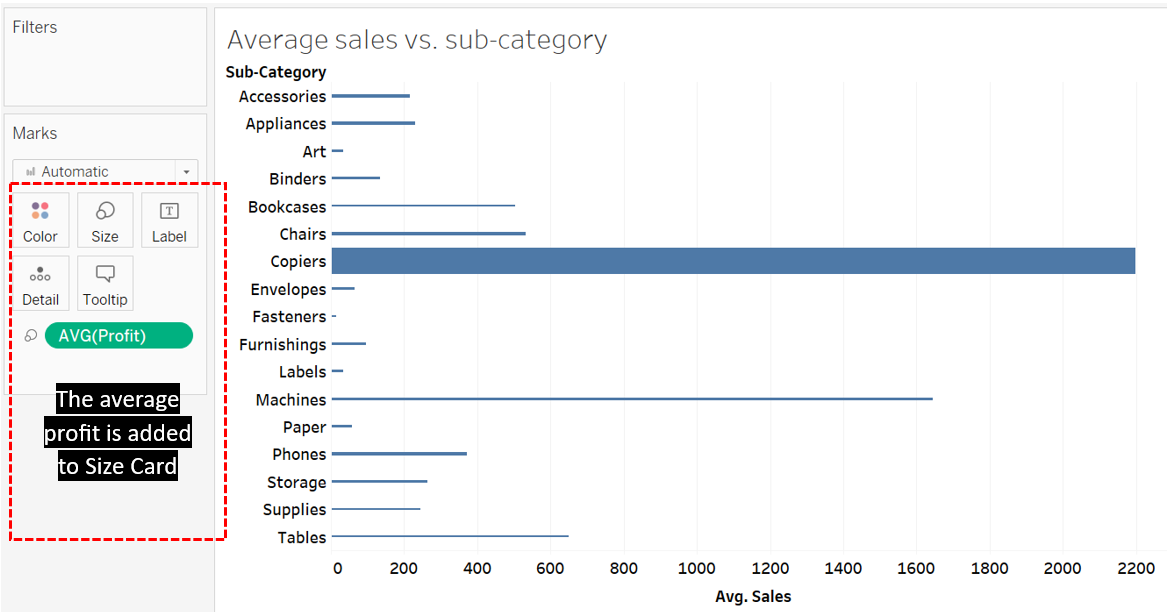
- Users have the flexibility to customize marks based on the values of two fields, potentially revealing hidden relationships between both fields. For instance, in VIZ 3, users can leave the height of the bars to reflect average sales, while adjusting the width based on average profit. Based on the chart, it is interesting to note that the average profit is not actually proportional to average sales. Despite machines and tables ranking second and third in sales, respectively, their average profits appear relatively low, as reflected by their bar width.
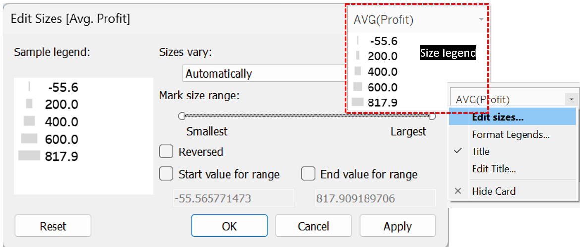
- Users can edit further the mark size scale using the Edit Size option. Edit Size appears when the users click the down arrow located in the size legend.
Exercise 5
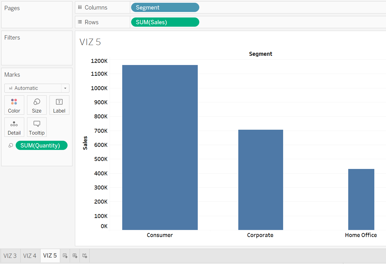
Open a new worksheet and rename it to VIZ 5. Generate a bar graph displaying the sum of sales per customer segment. Adjust the width of the bars according to the sum of quantity. What inference can you draw regarding the relationship between the sum of profit and the sum of quantity?
Solution – Exercise 5
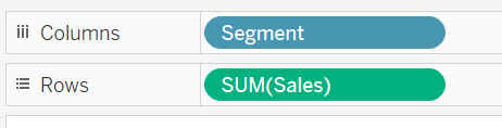
Step 1: Drag and drop the Customer Segment field onto the Columns shelf and the Sales field onto the Rows shelf.
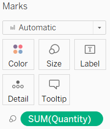
Step 2: Drag and drop the Quantity field onto the Size Card.
Step 3: From the chart, it is evident that the total sales per customer segment increases with the quantity of orders.
Exercise 6
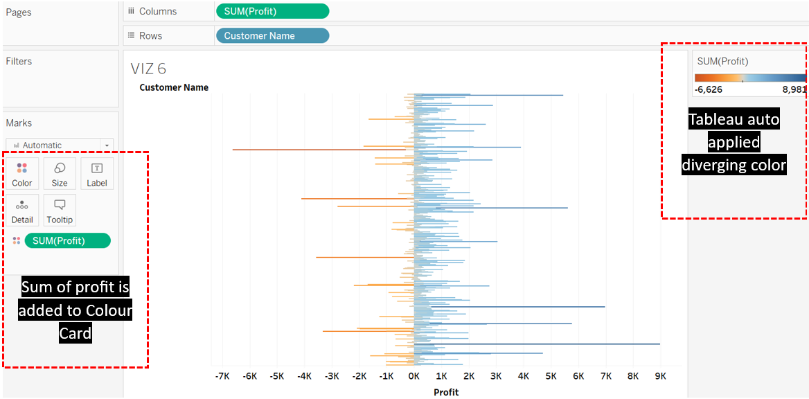
Open a new worksheet. Rename it to VIZ 6. Create a bar chart showing the total profit against each customer‘s name. Add the Profit field to the Colour Card. What type of colour was applied to VIZ 6?
Solution – Exercise 6
Tableau automatically assigns diverging colours to VIZ 6 since the total profit values span both negative and positive ranges.
Label Card
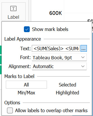
Tableau offers the option to include labels on marks, which can display values pertinent to those marks. These labels can be based on one or more fields, added by dragging and dropping fields onto the Label Card found in the Marks shelf. Additionally, users have the flexibility to format various aspects of the labels, such as colour, alignment, font type, font size, and text direction according to their preferences. Users can easily access label formatting by clicking on the Label Card. Furthermore, users can specify whether to display labels for all marks, selected marks, highlighted marks, or marks with maximum and minimum values.
Exercise 7
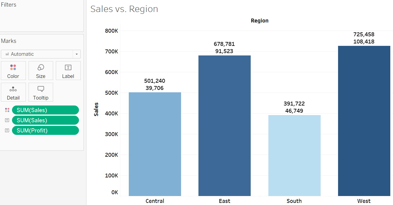
Add the sum of sales and profit information to each region in VIZ 1 and include tags within these labels to differentiate between sales and profit.
Solution – Exercise 7
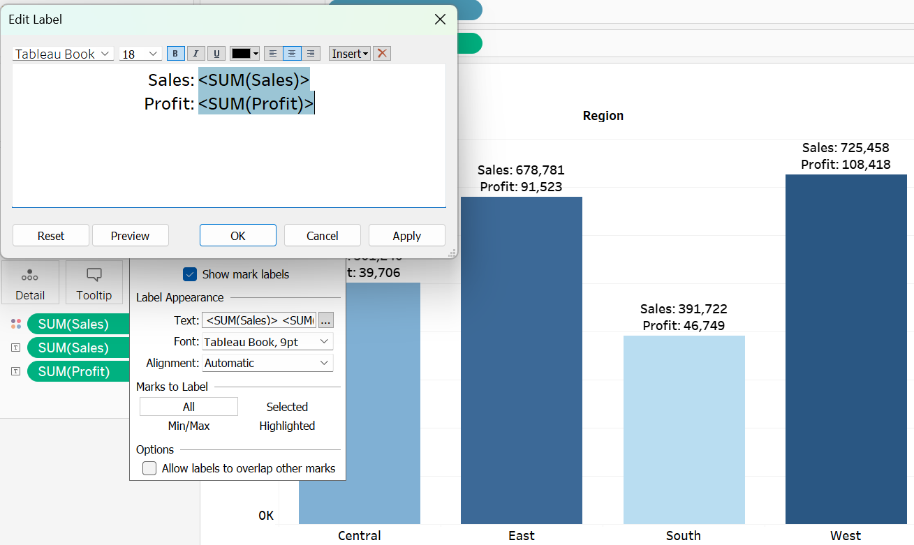
Step 1: Add the Sales and Profit fields to the Label Card.
Step 2: Click the Label Card, followed by clicking the three dots provided in the label formatting pop-up.
Step 3: Revise the labels by including the terms “Sales” and “Profit”, then click OK.
Exercise 8
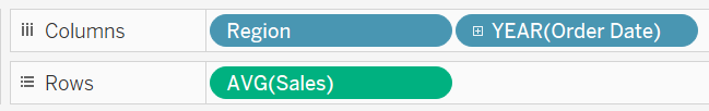
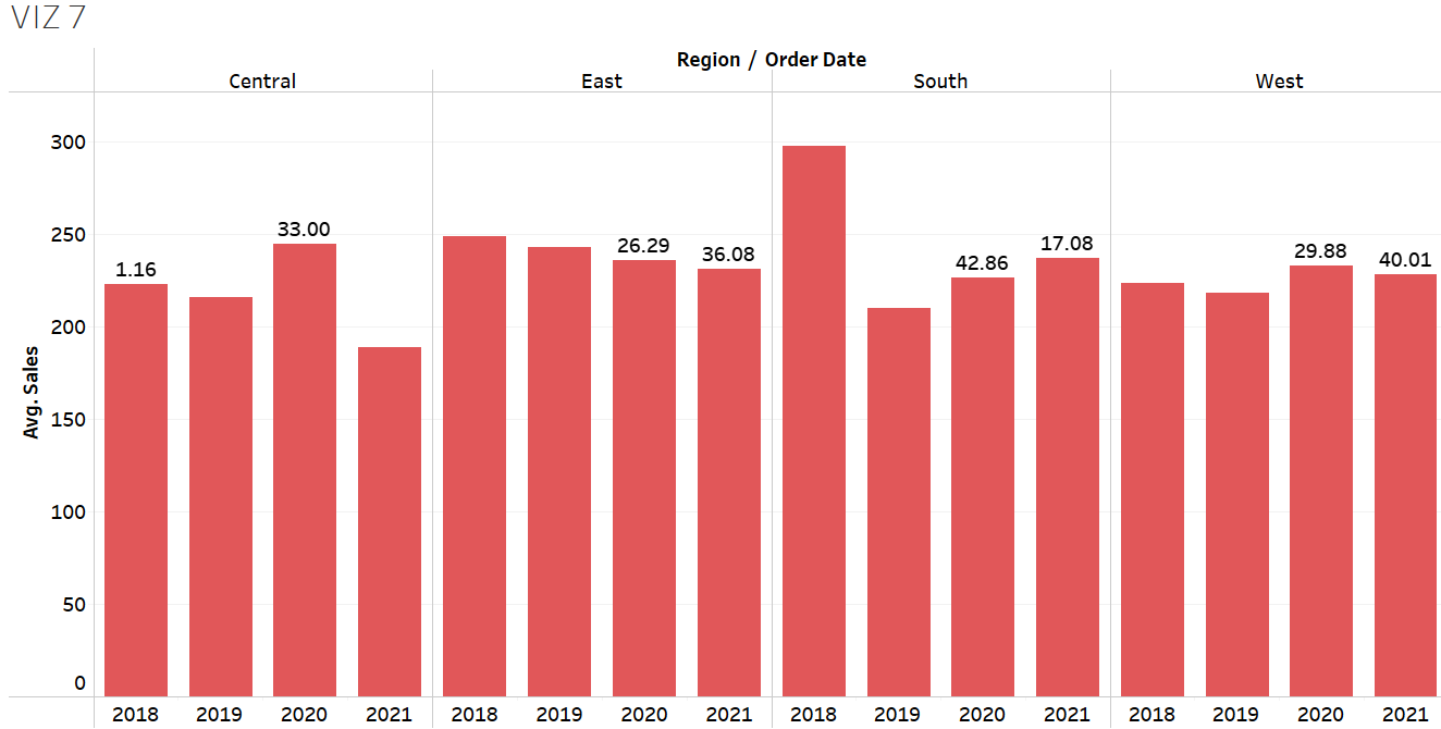
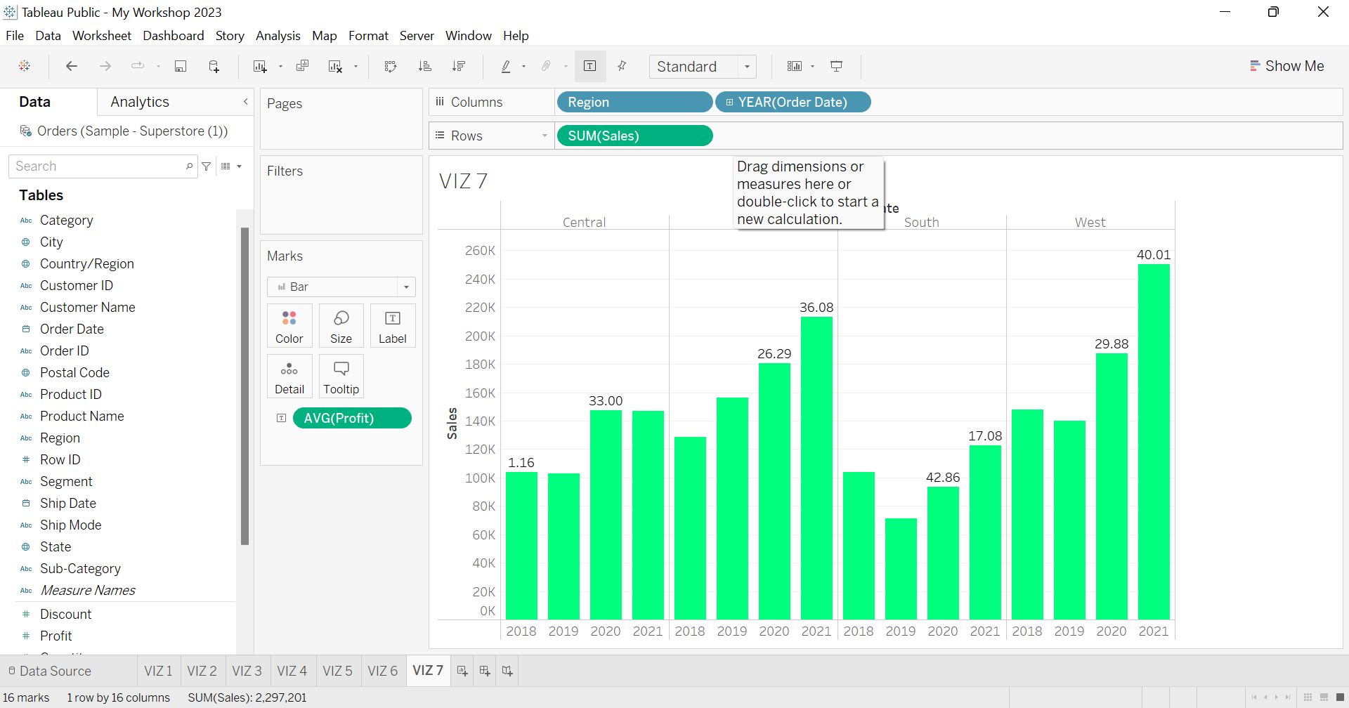
Open a new worksheet and rename it to VIZ 7. Create a bar graph showing the average sales per region per order date (by year). Convert the colour of the marks to red. Include labels on the years highlighting the minimum and maximum average profit within each region. In which years, the maximum and minimum profits were recorded for the South region? Also, compare the average sales corresponding to these maximum and minimum profit values, and comment.
Solution – Exercise 8
Step 1: Place the region and order date in the Rows shelf, and the sales in the Columns shelf. Make sure to aggregate sales using the average measure.
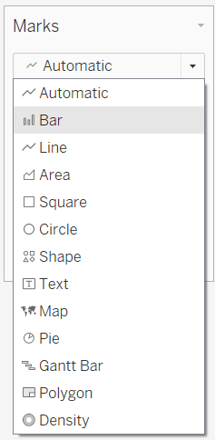
Step 2: Normally, Tableau automatically creates a line graph if a date field is involved. As such, to convert the chart into the intended bar graph, switch the type of marks to Bar by clicking the drop-down located on the Marks shelf.
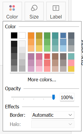
Step 3: Click the Colour Card to switch the default blue colour of the marks to red.
Step 4: Add average profit to the Label Card. Then, access the Label Card to further format the data labels. Within the label formatting pop-up, select Min/Max under Marks to Label, and Pane under Scope. This configuration ensures that labels are only shown on the years with the maximum and minimum profit within each region.
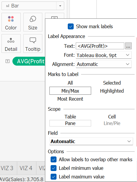
Step 5: According to the chart, it is evident that the South region attained its highest average profit in 2020, whereas the lowest average profit was registered in 2021. Specifically, there was an average profit of $42.86 in 2020 compared to $17.08 in 2021. Interestingly, these average profits contradict the average sales recorded for both years, with 2021 showing higher average sales compared to 2020.
Detail Card
Marks within a visualization are divided by dimension members when users add a dimension field to the Detail Card. For instance, in VIZ 1, each region mark is separated based on three customer segments, distinguished by distinct colour codes when the Customer Segment field is added to both the Detail and Colour Cards. The labels for each region are also displayed according to each separated customer segment.
Tooltip Card
Tableau tooltip helps to display additional relevant information in the form of a text box when the users hover the mouse cursor or click the marks of a visualization. Usually, the data of all fields placed in Columns, Rows, Marks, Filters, or Pages shelves, are automatically displayed in the tooltip. The tooltip helps provide extra information to the viewers without muddling the visualization with too many labels or annotations.
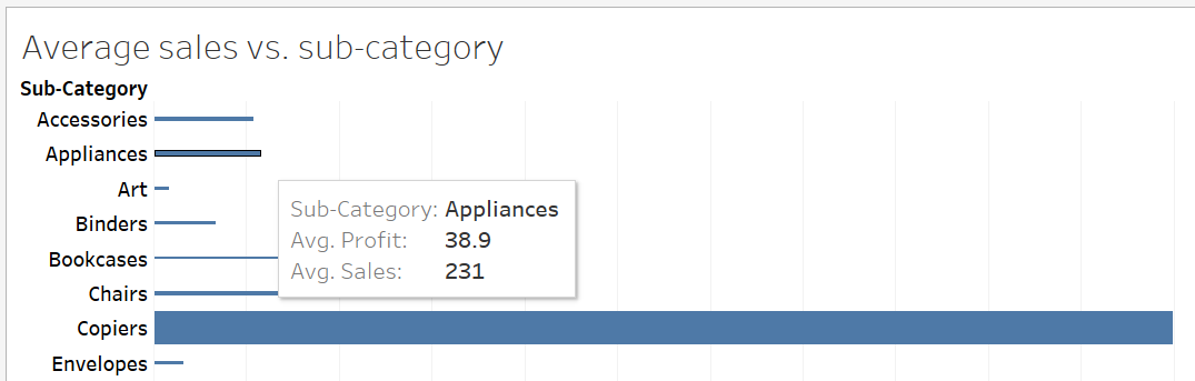
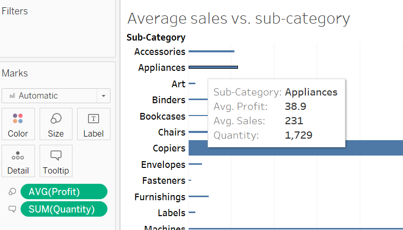
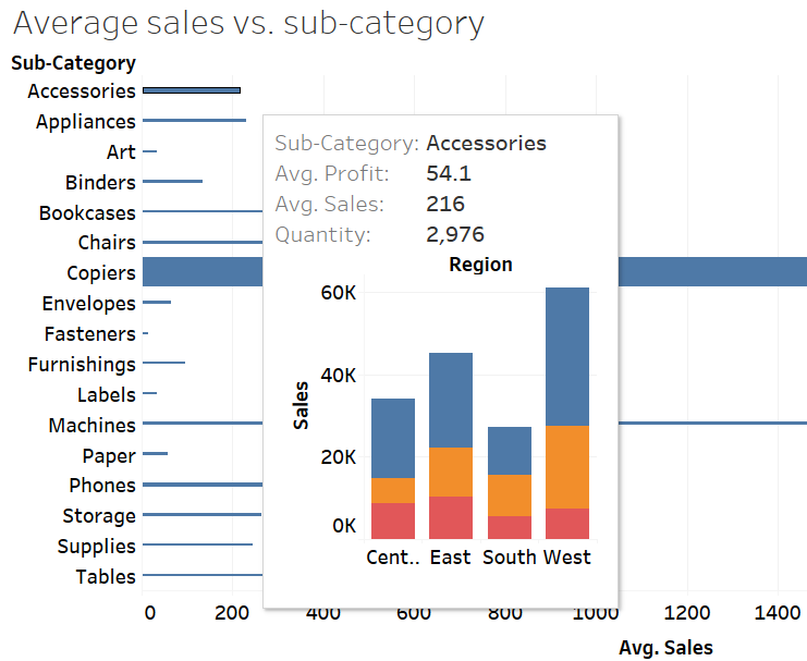
For example, in VIZ 3, the tooltip only shows the type of sub-category item, the average sales and the average profit when the cursor is moved over the marks.
Nevertheless, if users wish to add the sum of the quantity ordered in the tooltip, they can simply drag and drop the Quantity field onto the Tooltip Card.
The colour, alignment, font type, and font size of the information in the tooltip can also be formatted as per the users’ preferences. Users can perform such formatting on the Edit Tooltip that pops out once the Tooltip Card is clicked.
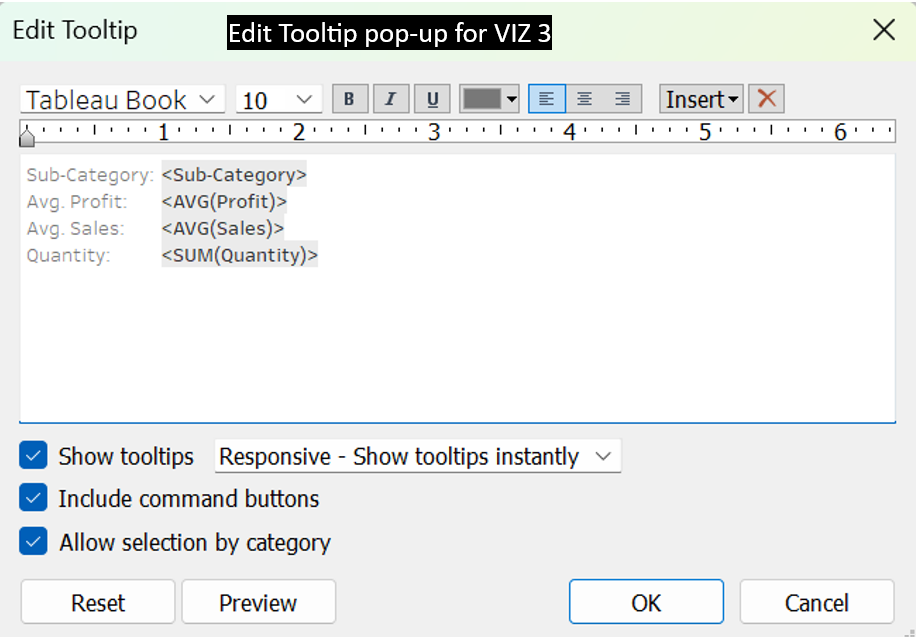
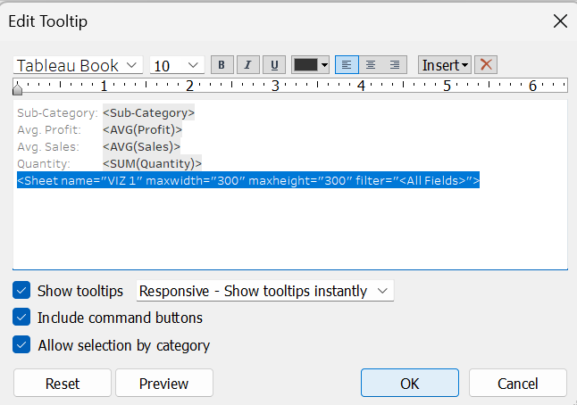
Users can also link the tooltip with a chart available in the other worksheet. For example, assume that we want to further compare the sales of sub-category items in VIZ 3 according to region and customer segment. As such, we can add VIZ 1, which shows sales per customer segment per region, to the tooltip in VIZ 3. The steps of adding the VIZ 1 in the VIZ 3‘s tooltip can be summarized as follows:
Step 1: Click the Tooltip Card.
Step 2: Choose Insert in the Edit Tooltip and choose the sheet where the targeted chart is located.
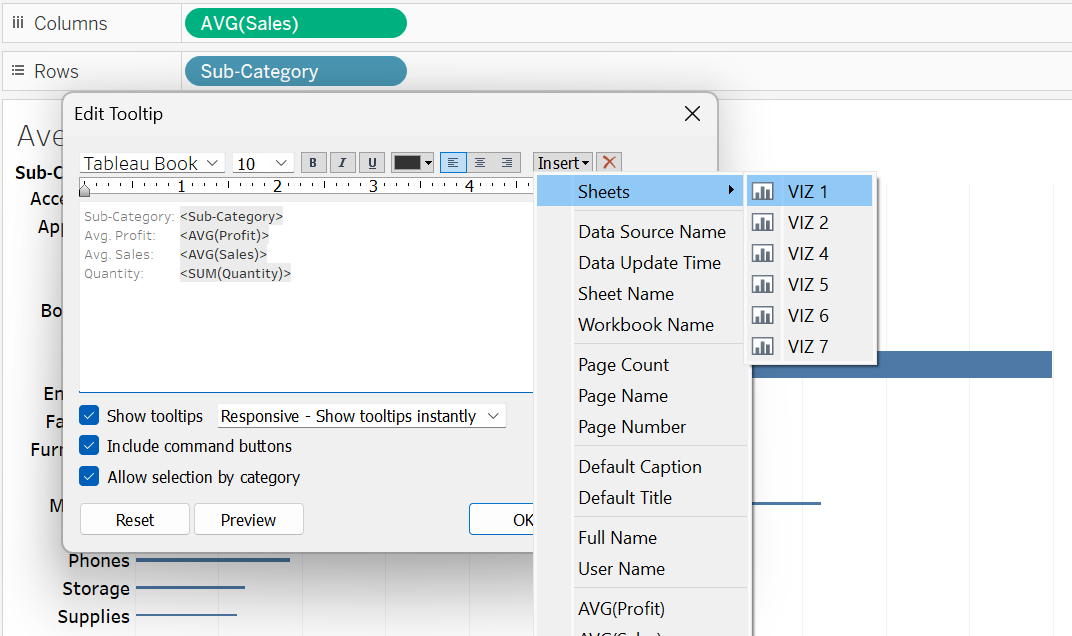
Step 3: Click OK to apply the changes.
It can also be noticed that data of VIZ 1 available in the tooltip gets adjusted based on the selected sub-category item in VIZ 3.
Hierarchical Fields
A hierarchical field refers to a structured arrangement of related fields into logical parent-child levels that allows for drill–down (viewing more detailed data) and roll–up (aggregating data at a higher level).
A hierarchical field is denoted by a plus (+) sign. Clicking the plus sign expands the visualization’s marks to reveal additional layers of information, providing users with more detailed insights at each sub-level.
An example of a hierarchical field is the Order Date field. Users can expand the data in VIZ 7 from year to quarter, month, week, or day levels only by clicking the (+) sign found in the order date field. Conversely, the (-) sign can be used to condense (roll–up) the levels of data in the visualization.
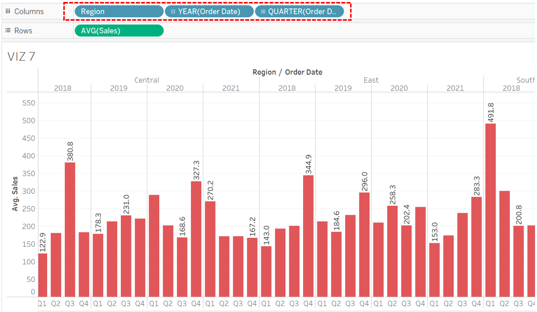
Users also have the option to create their own (logical) hierarchy field. This is achieved by dragging the sub-level field from the Data Pane and laying it directly over the main level field. For example, users could establish a hierarchy field featuring country (main level), state (sub-level), and city (sub-sub-level).

