1 CREATING YOUR FIRST VISUALIZATION
|
|
By the end of this chapter, readers will be able to:
|

Business Intelligence and Visual Analysis
Business intelligence (BI) refers to the use of various systematic procedures and technologies to gather, analyze and present data to gain meaningful business insights. It, therefore, promotes data-driven decision-making within a business organisation.
Data visualisation is one crucial component of BI. It involves the conversion of massive-sized raw data into graphical information using various traditional or advanced charts, graphs, geo maps, dashboards, etc. In the context of business, data visualisation helps in the detection of hidden correlations between various business performance metrics, business trends, outliers in the data etc., which enables the users to make better-informed decisions.
Data visualization also enables users to efficiently communicate data insights across different levels of an organization. Charts and graphs can simplify complex information from the available raw data, making it easier for the audience to ingest and digest the presented information.
There is a wide range of powerful, modern data visualisation tools available in the current marketplace, including Tableau. These modern tools can help in producing traditional and advanced visualisations as per a user’s needs. More importantly, these tools allow the users to interact further with the visualisations to seek the needed information. For instance, they can drill down into specific data points or filter the visualisations based on certain criteria.
The figure below summarises the connection between BI and data visualisation, and three popular modern data visualisation tools.
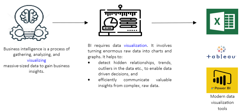
Tableau As a Visual Analysis Tool
Chris Stolte, Christian Chabot, and Pat Hanrahan founded Tableau Software in 2003 intending to enable users to visualize and comprehend their data effectively. Below are several advantages offered by Tableau:
- It enables users to connect to a variety of data sources, including databases, spreadsheets, cloud services, and more. It allows users to combine multiple data sets for visual analyses. However, the focus of this training book is only narrowed to guide readers on connecting data from an EXCEL spreadsheet.
- Users can dynamically explore data thanks to the interactive visualisations that can be built with Tableau. Users can use filters, do drill-down investigations on specific data points, or customize the visualizations to gain a deeper understanding and answer ad-hoc questions.
- Users can create visuals merely through a few drag-and-drop actions.
- Users can construct a dashboard quickly by combining two or more visualizations.
- Users can develop a storyboard by merging more than one visualization/dashboard, which can used to efficiently share data insights to different stakeholders.
- Tableau integrates advanced analytical functions. Within the tool itself, users can perform complex calculations, predictive modelling, and statistical analysis.
Tableau is well-suited for fast handling massive amounts of data, unlike Power BI which may become sluggish when managing such huge data. Tableau also connectivity to a wider array of database sources and servers, such as Excel, Text Files, Google Sheets, and PDF Files, among others, in comparison to Power BI.
On the other hand, although Microsoft EXCEL appears as a very common tool used for data visualization purposes, it only handles data up to certain rows. In contrast, Tableau can handle unlimited rows of data.
Installing Tableau Public
Ever since its establishment, many versions of Tableau products have been launched in the market, such as Tableau Desktop, Tableau Public, Tableau Server, and Tableau Cloud.
Tableau Desktop is the first product of Tableau, which offers a user-friendly drag-and-drop interface for creating visualizations from various data sources. Whereas Tableau Public is a free version of Tableau Desktop. It has all the essential features of Tableau Desktop, but the designed visualizations can only be saved and published to the Tableau Public website for public access and sharing; users cannot save the visualisations locally on their computers.
This book guides the readers to perform data visualization using Tableau Public since is not only free but also the ideal choice for beginners aiming to learn Tableau. The following are the steps to download and install Tableau Public.
Step 1: Type public.tableau.com in the browser address bar and press ENTER.

Step 2: Click the Create menu available on the top of the webpage and choose the Download Tableau Desktop Public Edition option.

Step 3: Fill out the registration form and click the download button.
Step 4: Install the downloaded software to your system.
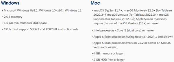
Note that Tableau Public is compatible with both Windows and Mac operating systems. To ensure optimal performance, all systems running Tableau Public must adhere to the specified minimum operating system requirements. Below is a screenshot from the official Tableau website detailing these requirements for both Windows and Mac platforms.
Connecting Data Source to Tableau Public
All demonstrations and hands-on exercises covered in this training book are based on the sample Superstore dataset. The superstore dataset is fictional sales data of a retail store offered by Tableau for practising purposes. The dataset is saved in a Microsoft EXCEL format, and it can be found in the Data Sources folder available in the My Tableau Repository folder, which is created in your computer storage once Tableau Public is installed.
As our first attempt, let us connect the Orders table from the Sample Superstore dataset. To establish this connection, follow the steps below.
Step 1: Launch Tableau Public.
Step 2: Under Connect, choose Microsoft Excel.
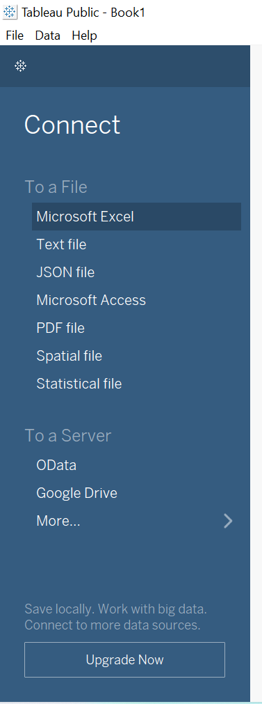
Step 3: Locate and open the Sample Superstore file.
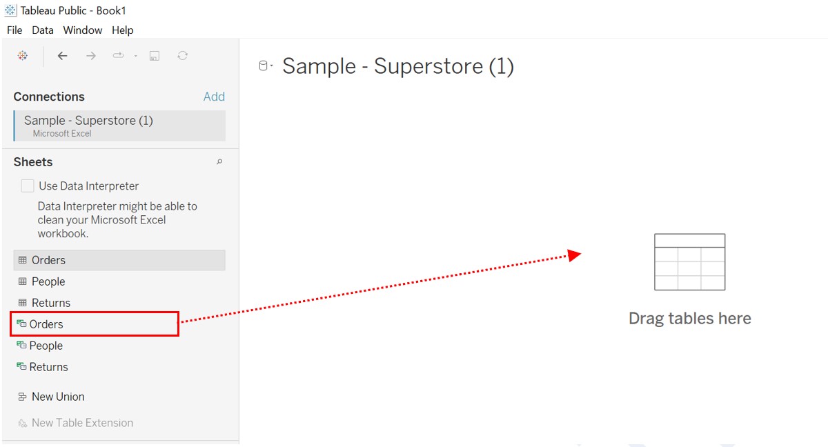
Step 4: At the Data Source page, drag the Orders table from the left pane and drop it in the connection canvas.
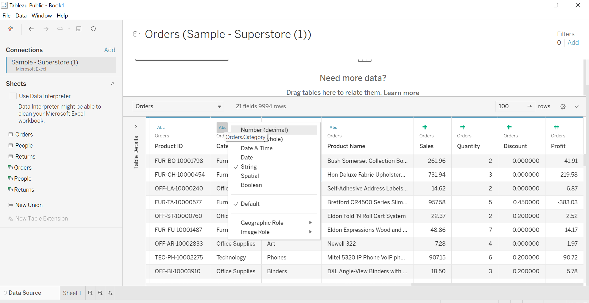
Once the connection is established, the Data Source page will immediately display the Data Grid of the table. The Data Grid can be used to preview the fields available in the table and the first few rows of the dataset. It can also be used to make general alterations to the data. For example, users can hide fields that are out of scope, rename fields, perform data sorting, create calculated fields, generate aliases, and more.
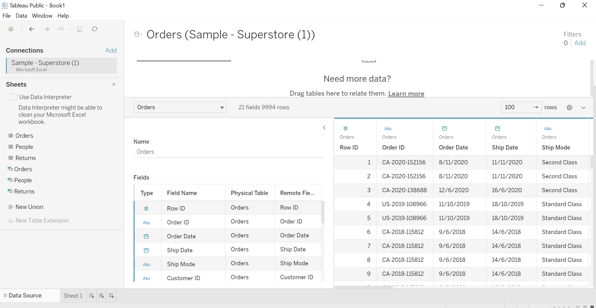
Users can also change the data type assigned by Tableau in the Data Grid if needed. Note that when we connect a data source to Tableau, the software automatically determines the data type and role of each field in the dataset:
- Data Type: Tableau determines the data type of each field, indicating the nature of the data values within that field. Common data types include:
- String: Represents textual or alphanumeric data, such as customer names or product descriptions.
- Numeric: Indicates numerical values, including integers or decimals. Examples are sales amounts, quantities, or prices.
- Date/Time: Denotes fields that contain date or time values, enabling time-based analysis and visualization.
- Boolean: Represents true/false or binary values, which are often used for filtering or conditional calculations.
- Geographic: Recognizes fields containing geographic information like latitude and longitude for mapping purposes.
- Role: Tableau assigns a role to each field based on the data type it carries. The two primary roles in Tableau are dimension and measure.
-
- Dimension: Fields that contain categorical or qualitative data, including string, date, Boolean, and geographic data, are classified as dimensions. Examples include customer names, product categories, or regions. Dimensions are typically used for grouping, filtering, and creating visual encodings like labels, colours, or shapes. Dimension fields are typically indicated by their blue colour.
- Measure: Fields that carry numeric or quantitative values are designated as measures. Examples include sales amounts, quantities, or profit margins. Measures are used for calculations, aggregations, and creating visual encodings like height, width, or size. Dimension fields are usually identified by their blue colour.
By automatically determining the role and data type of fields, Tableau can quickly start exploring and visualizing our data, making intelligent assumptions about how to handle and represent different field types in visualizations. Nonetheless, users have the flexibility to manually adjust the role or data type if such correction is needed to ensure precise analysis.
Creating the First Visualization
In this section, we learn to create our first visualisation based on the connected Orders data. The aim is to create a simple bar graph showing the sum of sales per region. Following are the steps to create the intended chart.
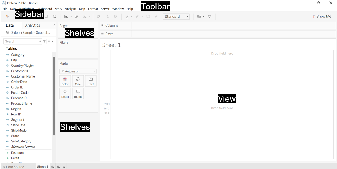
Step 1: Click Sheet 1 on the data source page to shift to the worksheet page. Following are some of the important items that can be found in the worksheet user interface.

- Sidebar: The sidebar has two panes, which are the Data Pane and Analytics Pane. The Data Pane shows the list of fields that are available for the analysis. Tableau sets apart the dimension fields from the measure fields using different colour codes. As mentioned earlier, dimension and measure fields are represented by blue and green colours, respectively. On the other hand, the Analytics Pane offers us some additional tools to perform advanced analyses e.g. average line, trend line, forecast etc., that can be applied to the available visualisation.
- Shelves: The key shelves are the Columns and Rows shelves, where we can drop the fields to determine the structure of the visualization. Other shelves include the Marks shelf (can be used to customize and add context to a visualisation), Filters shelf (can be used to control the level of details offered by a visualisation) and Pages shelf (can be used to help animate the transition of data points over a specific domain).
- View: View is the area where the visualization is displayed, and the users can interact.
- Toolbar: The toolbar is located at the top of the interface and contains various key items such as Data, Worksheet, Dashboard, Story, Analysis, and Format, meant for data visualization or presentations. The items in the toolbar permit the users to edit/refresh data sources, modify/enhance the appearance of the visualizations, add interactivity features, and apply calculations to the visualizations.
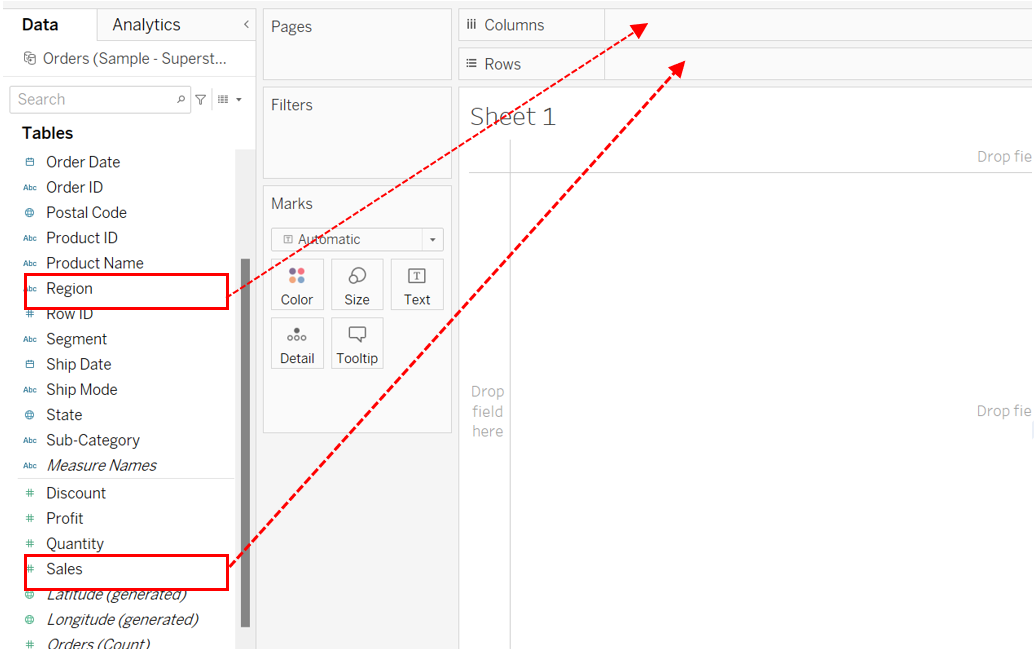
 Step 2: Drag and drop the Region field in the Columns shelf.
Step 3: Drag and drop the Sales field in the Rows shelf.
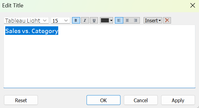
Step 4: Right-click the existing title and choose Edit Title to add the following title, Sales vs. Region.

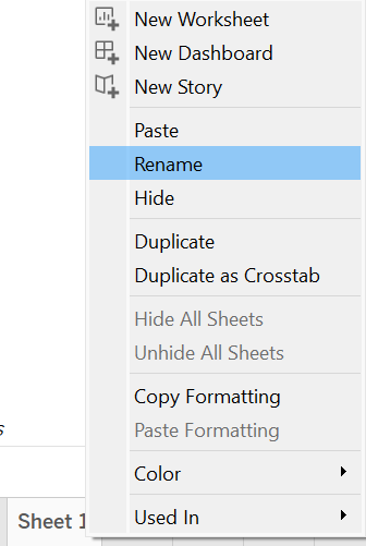
Step 5: Rename the worksheet to VIZ 1 (Hint: Right–click the Sheet 1 tab and choose Rename).
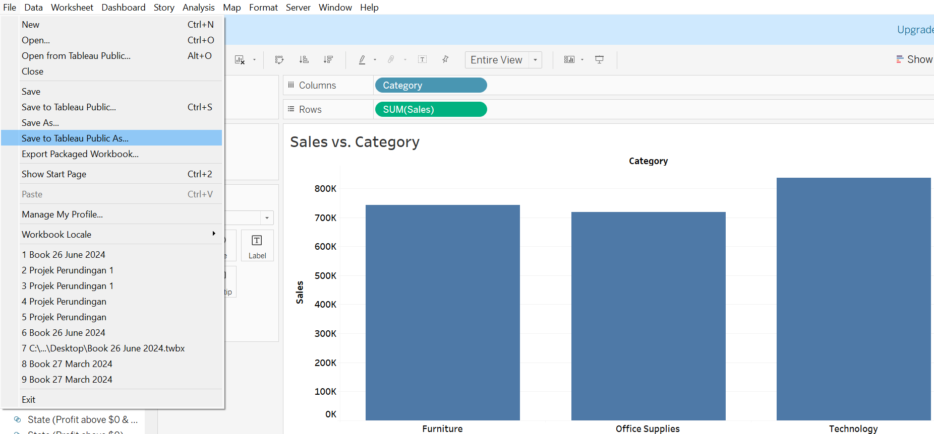
Once a visualisation is created, it can be saved and published on the Tableau Public portal.

The figure below shows the steps to save the visualization.

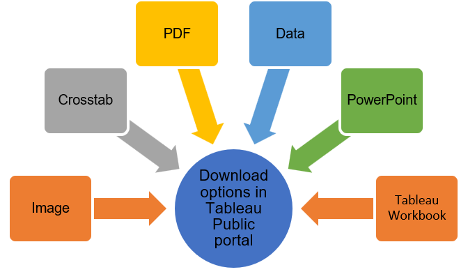
It is interesting to notice that the visualisation published in Tableau Public can also be downloaded into various formats, e.g., PDF, PowerPoint, Image etc., for reporting purposes (refer to the figure below). We can also customize the appearance of sheets and accessibility to the visualizations at our Tableau Public profile.
Exercise 1
Build a visualization that displays the sum of sales for each product category and modify the title accordingly before saving it in the same My First Tableau Project workbook.
Solution– Exercise 1
Step 1: Open a new worksheet and rename it to VIZ 2.
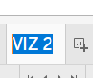
Step 2: Drop the Category field onto the Columns shelf and the Sales field onto the Rows shelf.
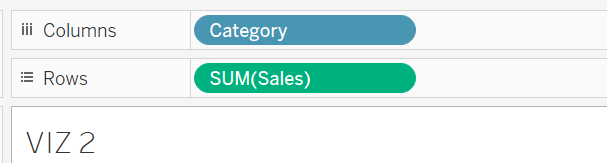
Step 3: Right-click on the exiting title and choose Edit Title.
Step 4: Revise the title accordingly and click the OK button.
Step 5: Click File on the toolbar and choose Save to Tableau Public As to save it in the same My First Tableau Project workbook.
Aggregation in Tableau
Aggregation aids in summarizing the level of data points presented in a visualization, which is useful for making quick decisions. Tableau automatically aggregates the data of a measure field when it is added to a visualization. The default aggregation performed in Tableau is Sum. The type of aggregation can also be switched to Average, Count, Minimum, Maximum, Standard deviation etc., subject to the goal of the analysis.
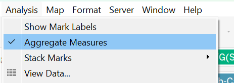
To have disaggregated (detailed) data points in the visualization, users may click the Analysis menu available in the toolbar and uncheck the Aggregate Measure sub-menu.
Exercise 2
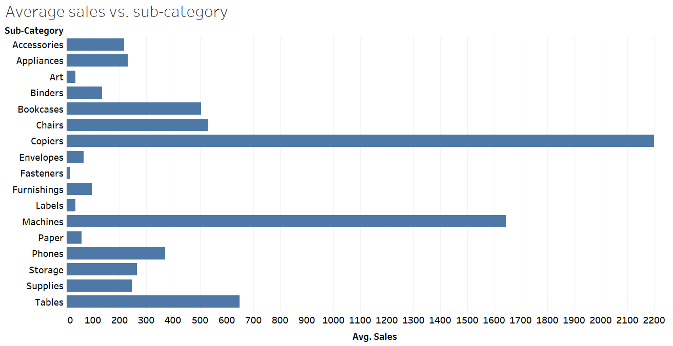
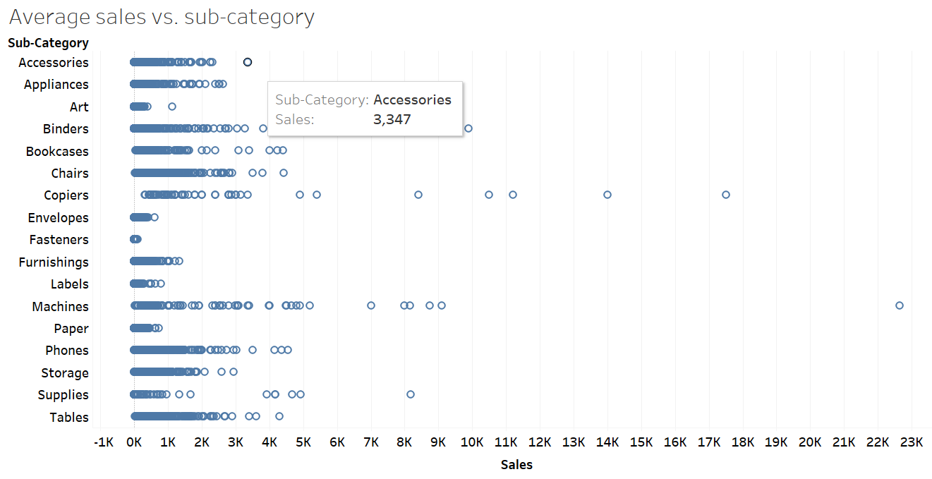
Open a new worksheet. Rename it to VIZ 3. Create a chart showing average sales per sub-category product. Change the chart’s title accordingly. Which sub-category product recorded the highest and lowest average sales, respectively?
Solution – Exercise 2
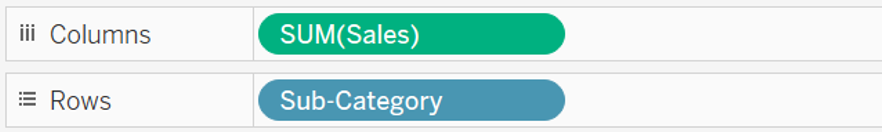
Step 1: Open a new worksheet. Rename it to VIZ 3. Drag and drop the Sales field onto the Columns shelf, whereas the Sub-Category field onto the Rows shelf.
Step 2: Right-click on the exiting title and choose Edit Title to revise the title accordingly.
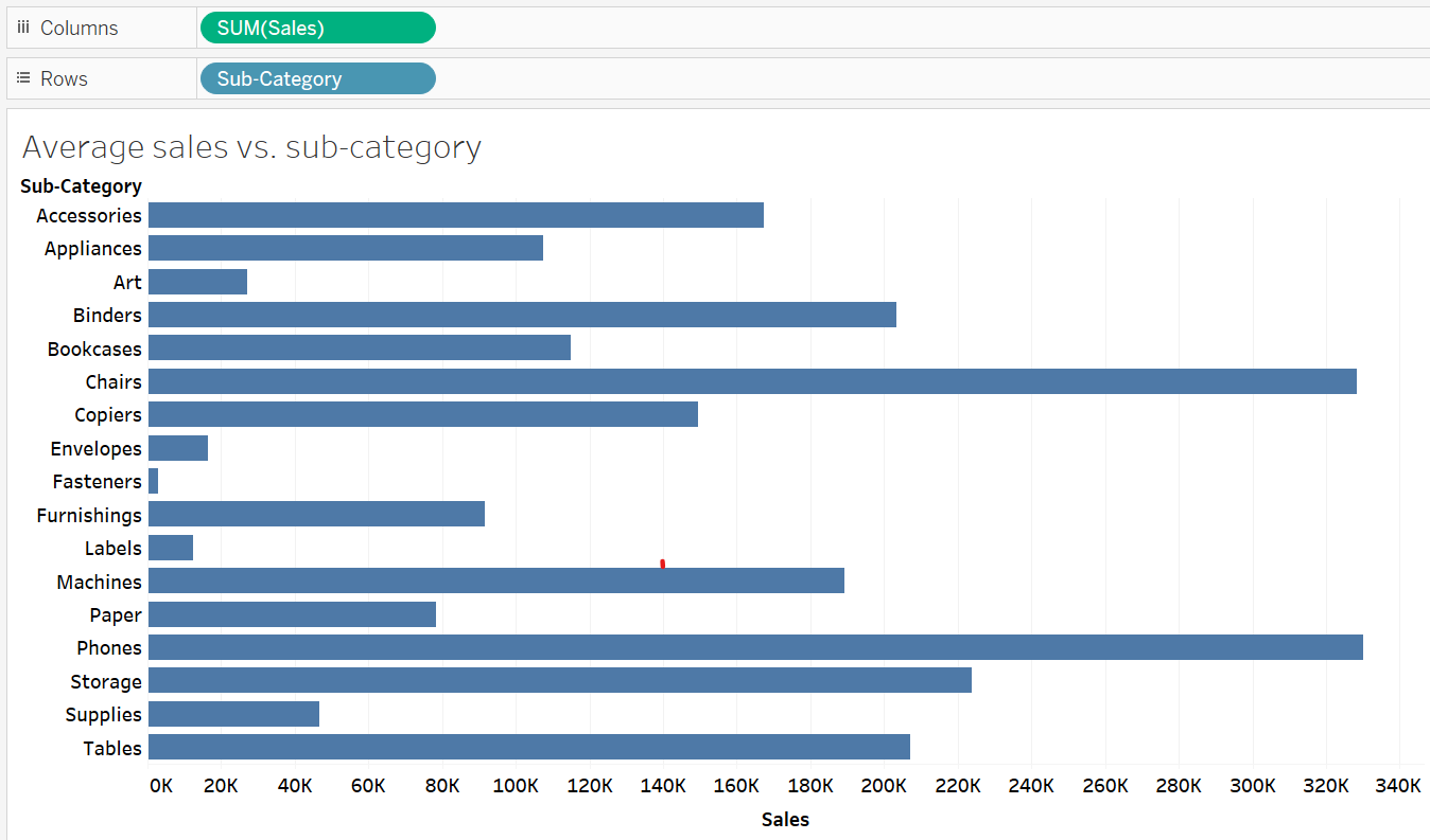
Step 3: Click the down arrow next to the Sales field available on the Rows shelf. Choose Measure to switch the aggregation type from Sum to Average.
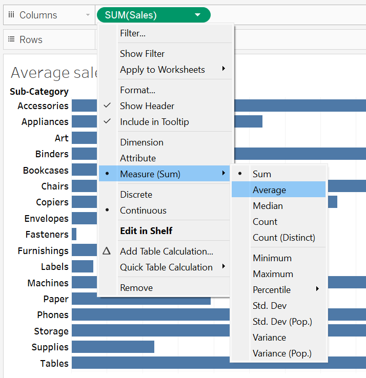
Step 4: Based on the chart, it is obvious that copiers earned the highest average sales. On the contrary, fasteners recorded the lowest average sales.
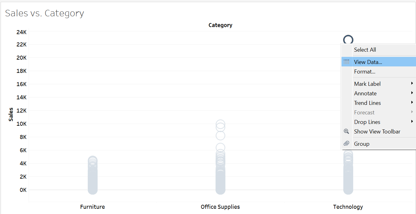
Exercise 3
Duplicate VIZ 3 to another worksheet. Rename the worksheet to VIZ 4. Disaggregate the data displayed in VIZ 4. What was the highest order sales ever recorded for the accessories?
Solution – Exercise 3
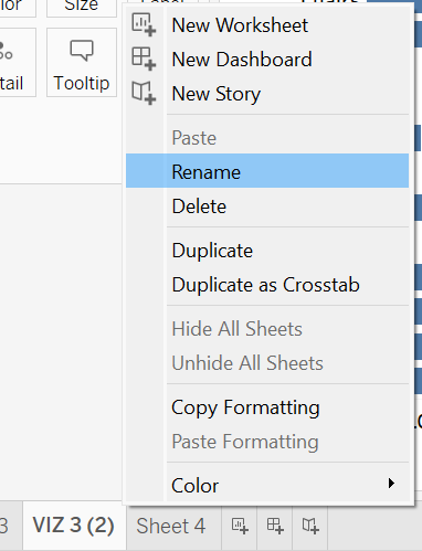
Step 1: Right-click on worksheet VIZ 3 and choose Duplicate.
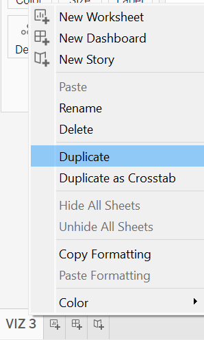
Step 2: Rename the duplicated worksheet to VIZ 4.
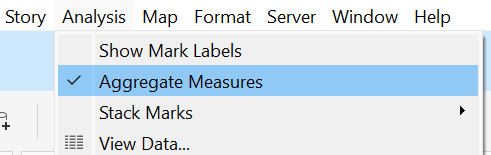
Step 3: Access the Analysis menu on the toolbar and deselect the Aggregate Measure sub-menu.
Step 4: Based on the chart, it can be concluded that the highest-ever order sales recorded for accessories was $3,347.
View Underlying Data
The View Data feature in Tableau enables users to inspect the underlying data of a visualization. It allows users to drill down particular marks or data points within a visualization to enhance insights through comparisons with other fields. It is particularly useful if the users wish to investigate outliers.
To explore the underlying data of a mark, simply right-click on the mark and select View Data. Users can also inspect the underlying data of multiple marks simultaneously by selecting them together using the Ctrl button.
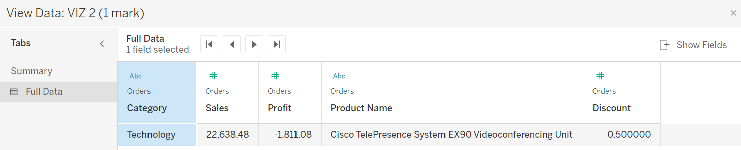
Exercise 4
Disaggregate the data in VIZ 2. What was the highest sales recorded for the technology category? What profit was achieved through this top sale? Which specific product contributed to this highest sale, and what discount was offered by the store for this purchase? Based on these comparisons, what conclusion can you draw?
Solution – Exercise 4
Step 1: Click on the Analysis in the toolbar and uncheck the Aggregate Measure option.
Step 2: Right-click the highest sale point for the technology category and choose View Data.
Step 3: Click Full Data, followed by the Show Fields button. Choose the profit, product name, and discount fields.
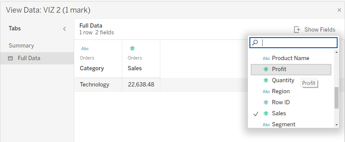
Step 4: With the help of the View Data feature, it is shocking to find out that the purchase which generated the highest sales actually resulted in a loss. Although the sale amounted to $22,638.48, it incurred a loss of $1,811.08. The specific product accountable for this loss was the Cisco TelePresence System EX90 Video Conferencing Unit. Furthermore, it was observed that the store offered a 50% discount for this product. This situation suggests that the store management should immediately re-examine and adjust the selling price or discount provided for the product to prevent such undesirable losses in the future.