3 DATA FILTERING AND SORTING
|
|
By the end of this chapter, readers will be able to:
|

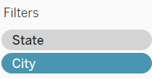
Filters
Filters can be used to control the degree of information depicted in a visualisation. In other words, users can include and exclude the type or level of information displayed in a visualisation, allowing a focused investigation. Filters also allow users to make certain comparisons for decision-making purposes, e.g., comparison between a selected range of dimension members, comparison across a selected range of periods etc.
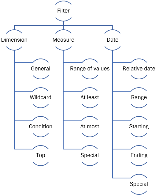
A filter dialogue box appeared immediately once the users dropped a field to the Filters shelf. This dialogue box permits the users to set the characteristics of the filter. The available characteristics in each dialog box vary according to the type of field dropped to the filter shelf i.e. dimension, measure, or date field. The figure shows the summary of filter characteristics according to each field type.
Filtering Based on a Dimension Field
When a dimension field, is dropped to the filter shelf, a dialogue box pops out, with each tab in the dialogue box representing a characteristic that the user can set to the filter:
- General Tab: Users can use the General tab to choose the dimension members that they wish to include or exclude. You can control the exclusion or inclusion of the data points later with the help of a filter control card. Filter control card will appear together with the visualization once the users click the Show Filter option.
- Wildcard: Users can use the Wildcard tab to filter the dimension members that follow a specific pattern. For example, when filtering on email addresses you might want to only include emails from a specific domain. You can define a wildcard filter that ends with “@ums.edu.my” to only include Universiti Malaysia Sabah email addresses.
- Condition: The Condition tab can be used to only depict dimension members that satisfy certain rules. For example, in a visualization that shows the sub-category products vs. the sum of sales, users can opt to only depict sub-category products that made at least $140,000 in sales by defining the condition tab.
- Top: The Top tab can be used to show the top or bottom N dimension members in the visualization based on a measure field. For example, users can customize the Top tab to only show the top 5 sub-category products in terms of total sales.
Exercise 9
With the help of the filter tool, create a bar graph that compares only the total sales between furniture and technology sub-category items.
Solution – Exercise 9
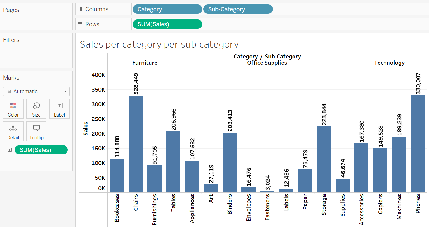
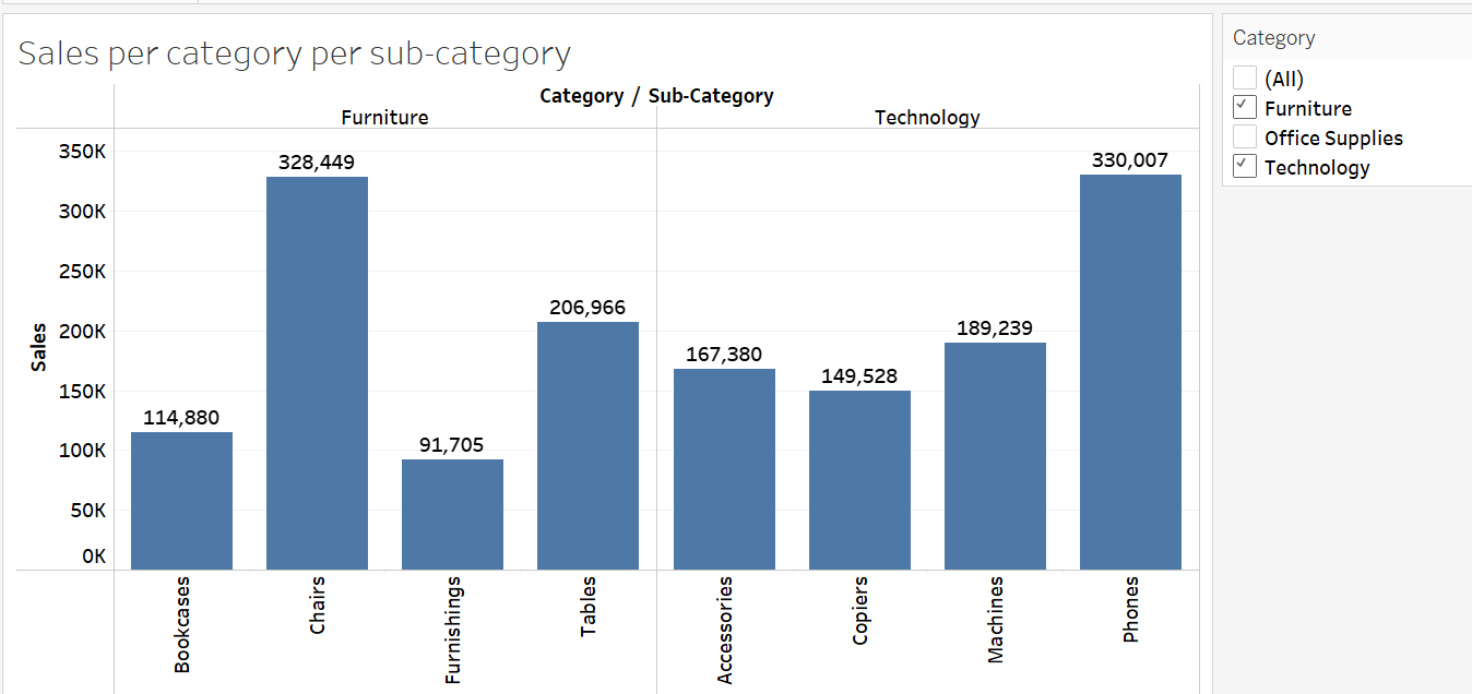
Step 1: Drop the Category and Sub-Category fields to the Columns shelf and the Sales field to the Rows shelf to create the intended graph. Name the sheet VIZ 8. Also, drop the Sales field onto the Label Card to add the sales information in the VIZ 8.
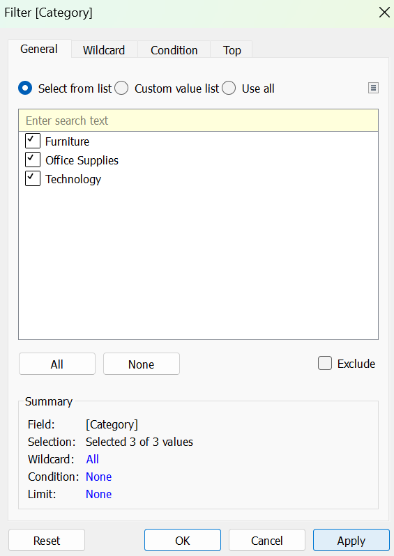
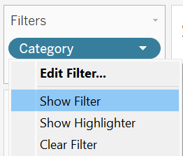
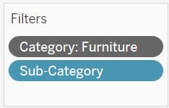
Step 2: Drag and drop the Category field onto the Filters shelf. In the dialog box that appears, under the General tab, include all the categories and click Apply, followed by OK.
Step 3: Click the down arrow next to the Category field located in the Filters shelf and choose Show Filter to display the filter control.
Step 4: Check the Furniture and Technology categories in the filter control to compare the sales of sub-category items that belong to both Furniture and Technology categories.
Exercise 10
Apply the condition filter on VIZ 8 to identify sub-category items with total sales exceeding $100,000.
Solution- Exercise 10
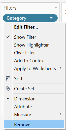
Step 1: Remove the existing filter in VIZ 8 by clicking the down arrow next to the field available on the Filters shelf.
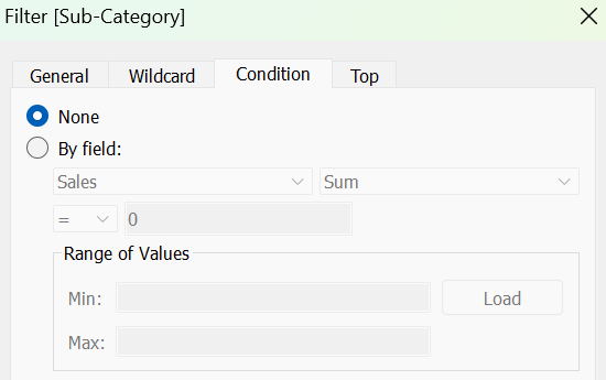
Step 2: Drag and drop the Sub-Category field to the filter shelf. Choose the Condition tab in the dialogue box that appears. Under the Condition tab, select By Field and set the values accordingly to meet our specifications.
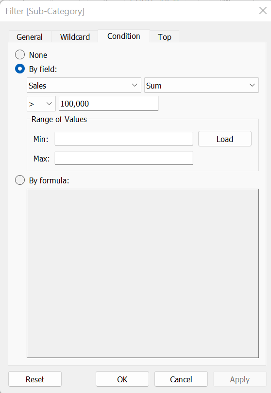
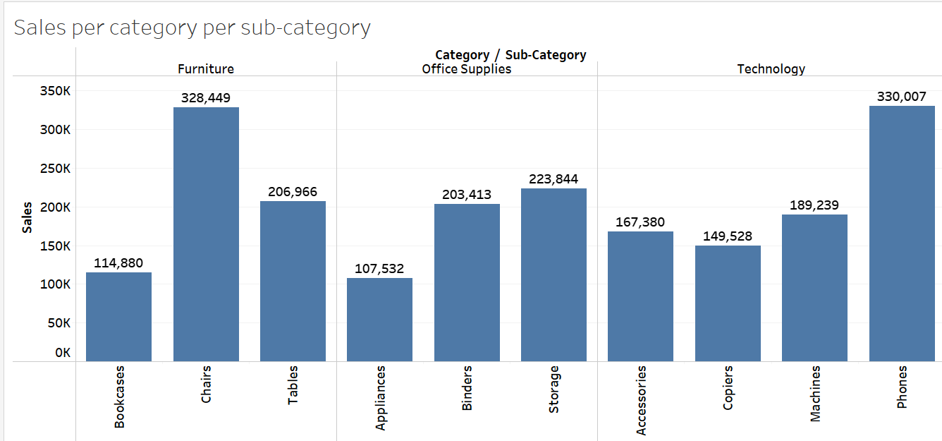
Step 3: Click Apply and OK to only display sub-category items exceeding a total sale of $100,000. The analysis points out bookcases, chairs, tables, appliances, binders, storage, accessories, copiers, machines, and phones as items meeting the condition set.
Exercise 11
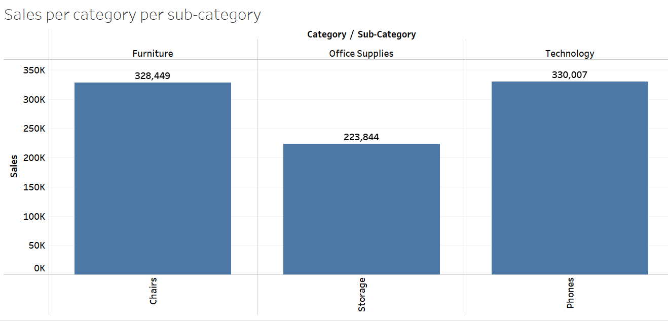
Apply the top filter on VIZ 8 to identify the top three sub-category items with the highest total sales.
Solution – Exercise 11
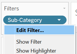
Step 1: Click the down arrow next to the Sub-Category field available in the Filters shelf, and choose Edit Filter.
Step 2: Under the Condition tab, select None to reset (remove) the condition setting.
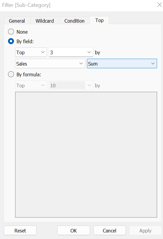
Step 3: Switch to the Top tab, choose By field, and set the values according to the needs of the analysis.
The filtered chart identifies phones, chairs, and storage as the top-selling sub-category items, achieving total sales of $330,007, $328,449, and $223,844 respectively.
Using Parameter with Top N Filter
A parameter can be combined with a Top N filter to dynamically adjust the “N” value without requiring users to repeatedly modify the “N” value in the filter settings. In Tableau, a parameter serves as a control mechanism that enables users to dynamically adjust an input value, resulting in corresponding adjustments to the visualization based on the selected parameter value. Parameters are highly beneficial for conducting what-if analyses, allowing users to observe visualization changes as input values are modified.
Exercise 12
Based on VIZ 8, create a parameter to allow the user to switch the top N sub-category items, with N ranging from 1 to 10.
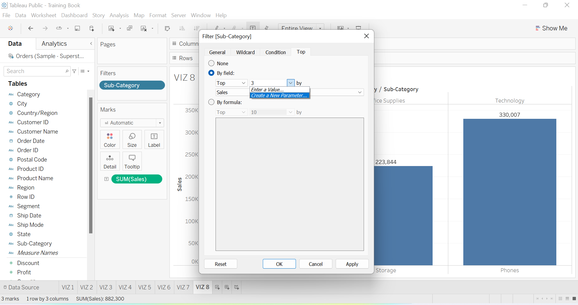
Solution – Exercise 12
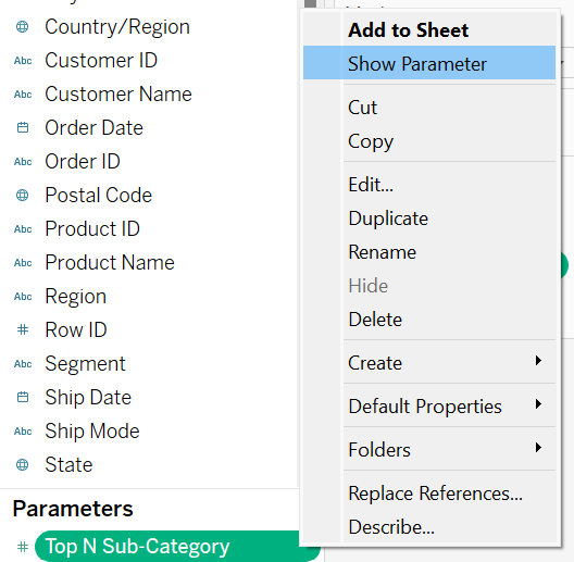
Step 1: Edit the Top N filter for sub-category by the choosing Create a New Parameter instead of entering a value like Top 1, 2, 3 etc.
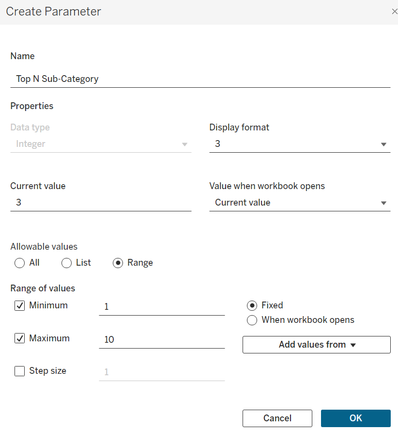
Step 2: The Create Parameter box pops out, in which we can customize the name and other features of the parameter. Name the parameter Top N Sub-Category, and set the range of values with 1 as the minimum and 10 as the maximum.
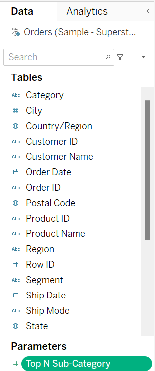
Step 3: The parameter is created and appears in the Data Pane once the OK button is clicked.
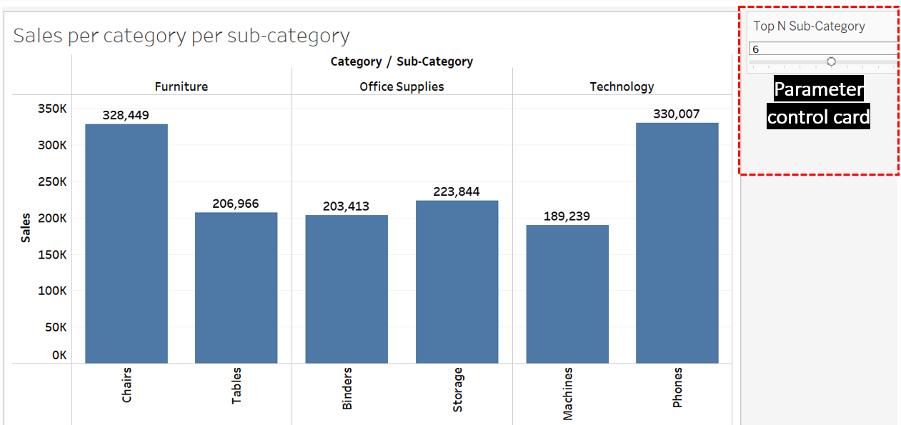
Step 4: Click the down arrow on the parameter and choose Show Parameter to display the parameter control.
Step 5 – The parameter control allows us to switch the input value, N, from 1 to 10 to display the top N category items. The visualization updates based on the selected value in the control.
Context Filter
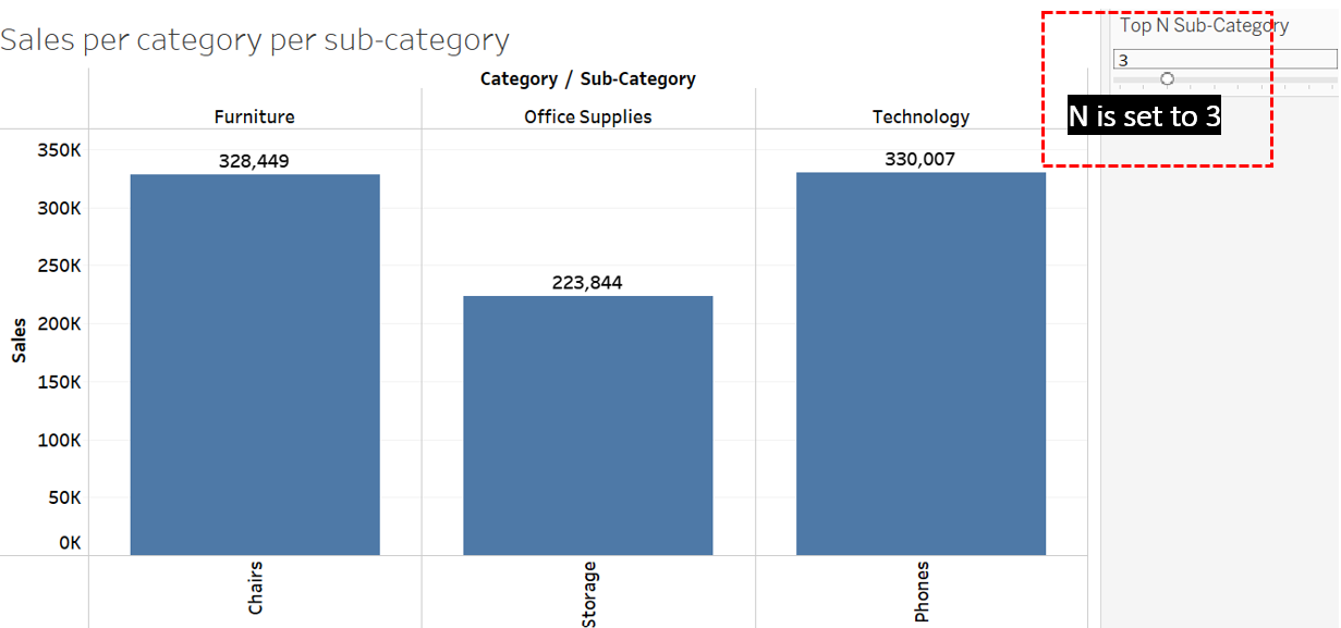
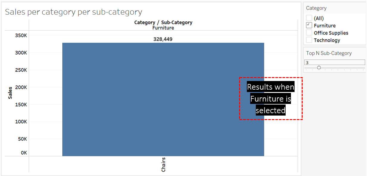
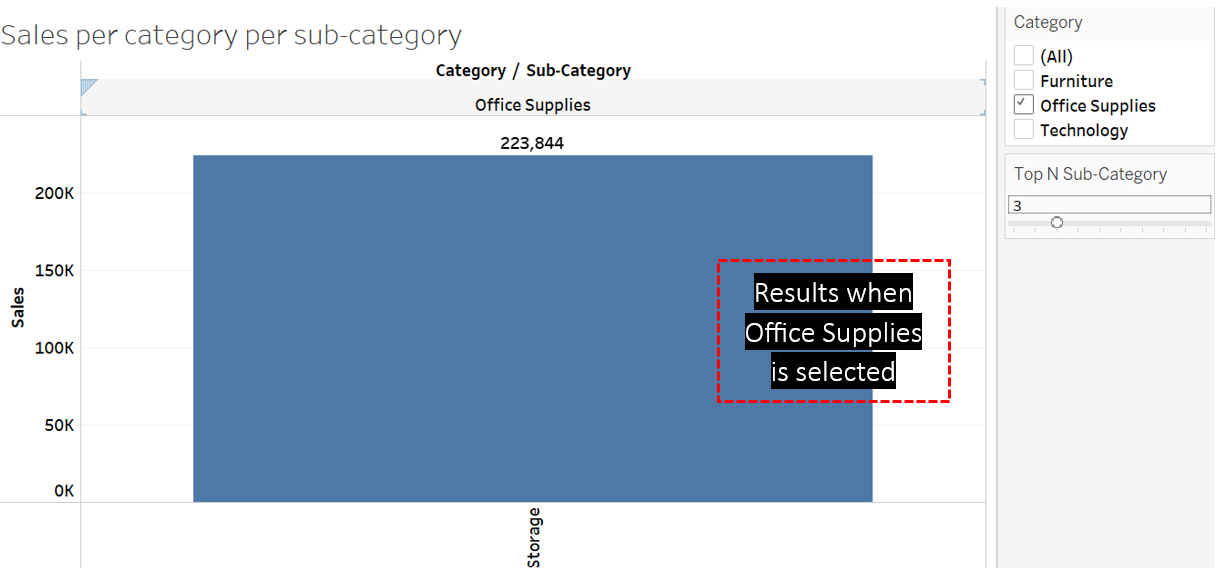
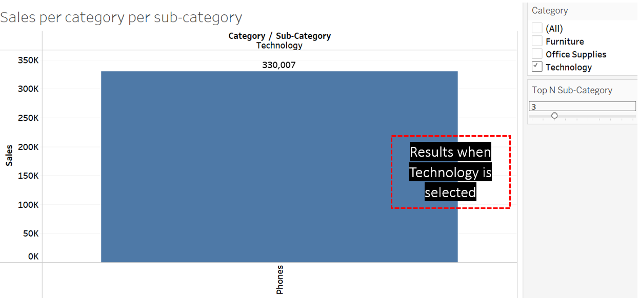
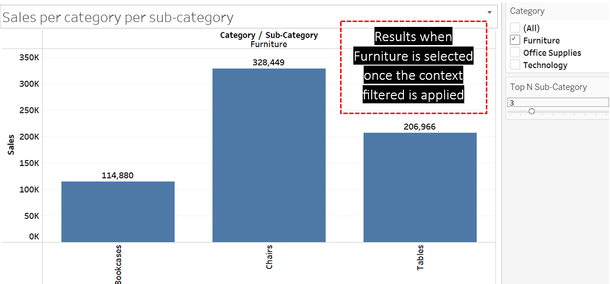
Set the Top N Sub–Category parameter value in VIZ 8 to 3. VIZ 8 now shows the top 3 sub-category items with the highest sales. VIZ 8 detects Phones from the Technology category, Storage from the Office Supplies category, and Chairs from the Furniture category as the top 3 sub-category items, regardless of the main Category that these items belong to.
However, assume that you now wish to find the top 3 sub-category items for each main category. As such, drop the Category field to the Filters shelf and locate it above the Sub-Category filter.
Click Show Filter to display the filter control for Category items and choose Furniture. Repeat the process by only choosing the Office Supplies and Technology categories. What did you notice? Is the visual showing the intended results?
We anticipate that the visualization will exhibit the top three sub-categories when each category is selected, but it behaves differently. For instance, when Furniture is chosen, only one sub-category is displayed. This occurs because Tableau initially applies the Top N Sub-category filter, scanning through the entirety of the data to identify the top three sub-category items before executing the second filter, which is the Category filter. Consequently, the second filter operates based on the results of the first filter.
To avoid this, we can use Context Filter. A context filter is a filter which is executed first before any other filters. When a filter is designated as a context filter, Tableau first applies that filter to the data and then uses the filtered data as the context for subsequent filters.
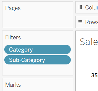
In this scenario, we should designate the Category as the context filter. To do this, click the down arrow next to the Category field available in the Filters shelf, and select Add to Context.
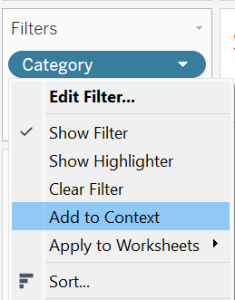
The Category field will then turn grey, indicating it is now a context filter.
Now, choose the Furniture option in the filter card. We can notice that the visualization now displays the intended results, showing the top three sub-category items for each category. What happens? When a category such as Furniture is chosen, Tableau filters the relevant data, and then performs the second filtering; it identifies the top three sub-categories solely based on the Furniture data filtered earlier.
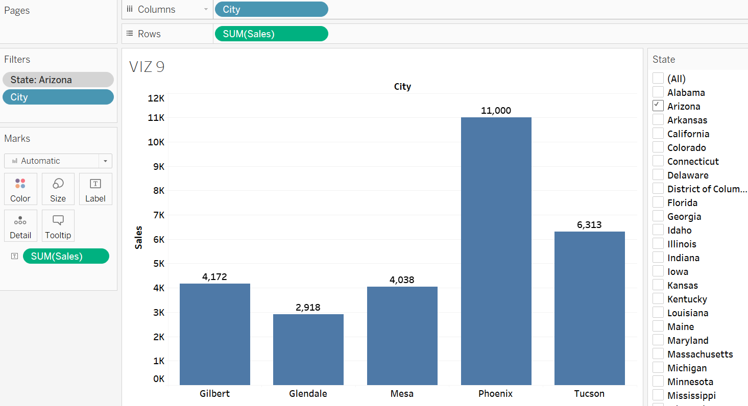
Exercise 13
Open a new worksheet and rename it to VIZ 9. Create a bar graph showing the sum of sales vs. cities. Apply a filter to identify the top 5 cities based on sales. Additionally, use a context filter to determine the top 5 cities specifically within the Arizona state.
Solutions – Exercise 13
Step 1: To create the desired graph, drop the City field to the Rows shelf and the Sales field to the Columns shelf. Rename the sheet to VIZ 9.
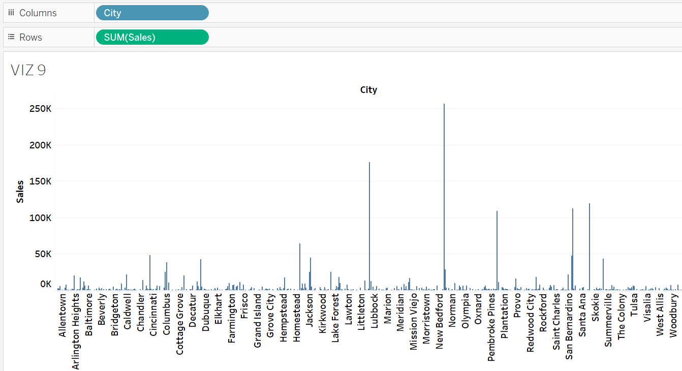
Step 2: Include the City field in the filter, then select Edit Filter to apply a Top N filter to identify cities with top five sales. The results indicate that, overall, New York City leads in total sales, followed by Los Angeles, Seattle, San Francisco, and Philadelphia.
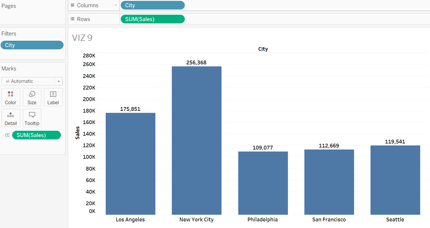
Step 3: Drop the State field to the Filters shelf and locate it above the City filter. Click the down arrow next to the State field available in the Filters shelf and select Add to Context.
Step 4: Click Show Filter for State, and check Arizona in the filter card. The results indicate that Phoenix is the city with the highest sales in Arizona state, followed by Tucson, Gilbert, Mesa, and Glendale.
Filtering Based on a Measure Field
When a measure field is added to the filter shelf, a dialogue box appears, providing users with the ability to display only dimension members that fall within a specified range of values. There are four filter options that can be applied to a measure field:
- Range of Values: This option enables users to exhibit only the dimension members that lie within a chosen minimum and maximum value range. For example, users can choose to display only the sub-category items that achieved total sales between $100,000 and $200,000.
- At Least: This option enables users to filter data to show only the dimension members that meet or exceed a specific threshold value. For example, users can choose to display only the sub-category items with total sales of at least $200,000.
- At Most: This option enables users to display only the dimension members that have a value equal to or less than a specified threshold. For example, users can choose to show only the sub-category items with total sales of at most $200,000.
- Specific: Utilize this option to determine whether to include only null values, non-null values, or all values in your analysis.
Exercise 14
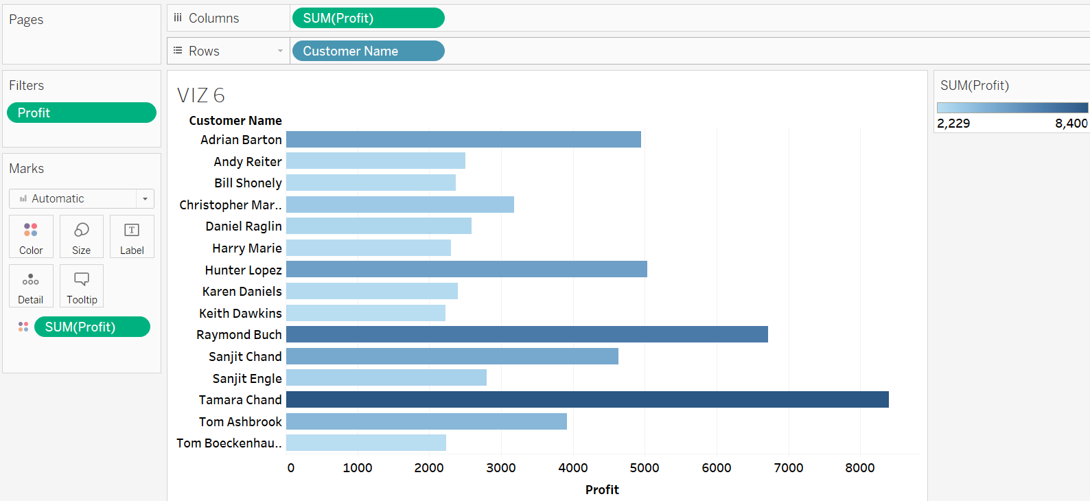
Using a filter in VIZ 6, identify the customer who contributed a minimum total profit of $2000 or more.
Solution – Exercise 14
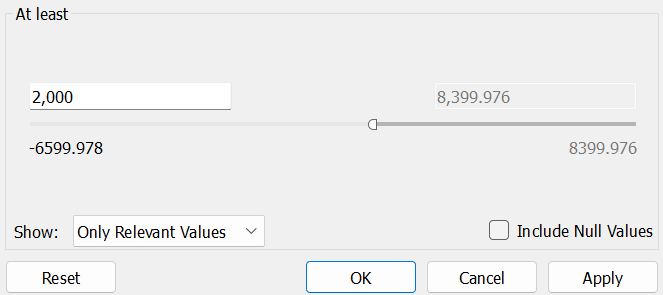
Step 1: Drop the Profit field to the Filters shelf and choose the At least option.
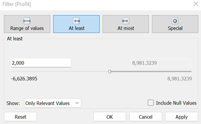
Step 2: Set the threshold value as $2,000.
Step 3: Click OK once setting the targeted value to get the list of customers who contributed a minimum total profit of $2000 or more.
Filtering Based on a Date Field
The level of data in a visualization can also filtered based on a date field. When a date field is added to the filter shelf in Tableau, users are provided with five options to customize the date filter:
- Relative Date: This option allows users to incorporate data from a number of days, weeks, months, or years preceding or following a particular date.
- Range of Dates: This option includes data within a selected range of two dates.
- Starting Date: This option includes data from a specific date onwards.
- Ending Date: This option includes data up to a particular date.
- Specific: This option determines whether to include only null dates, non-null dates, or all values in the analysis.
Exercise 15
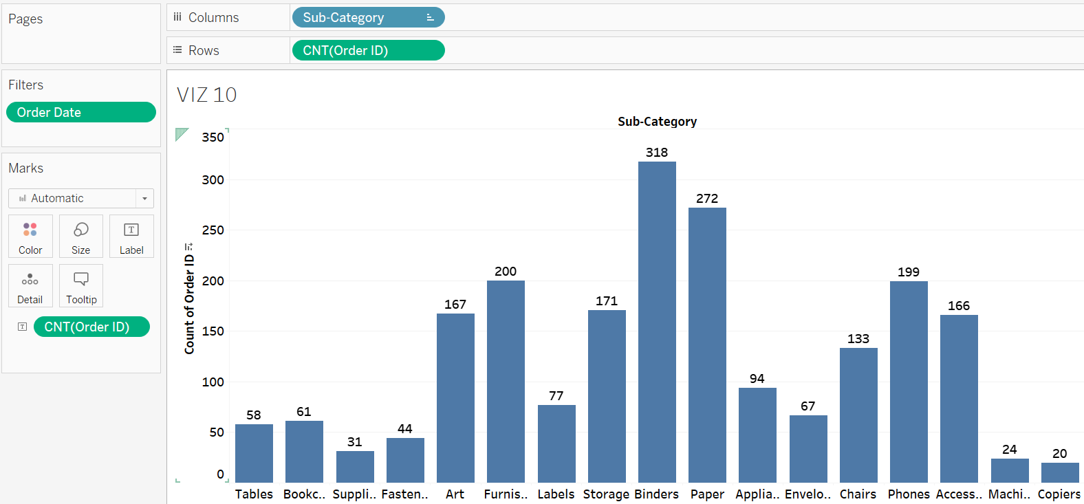
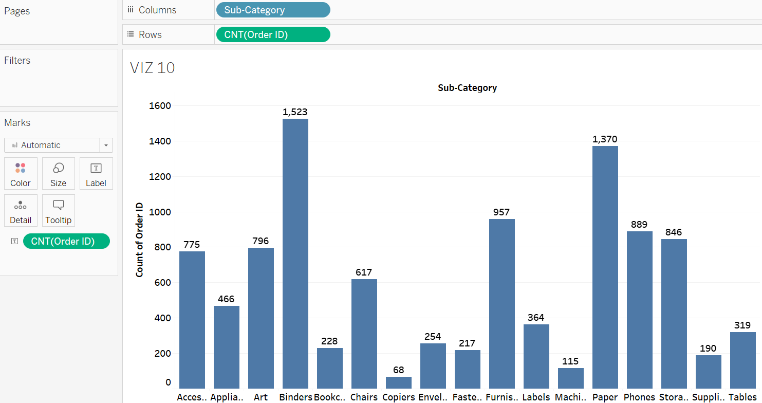
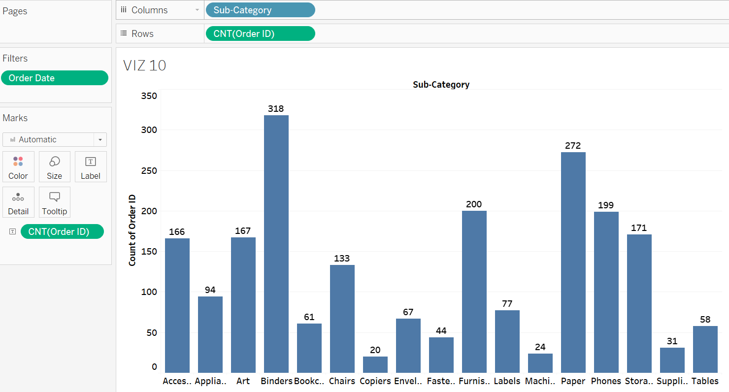
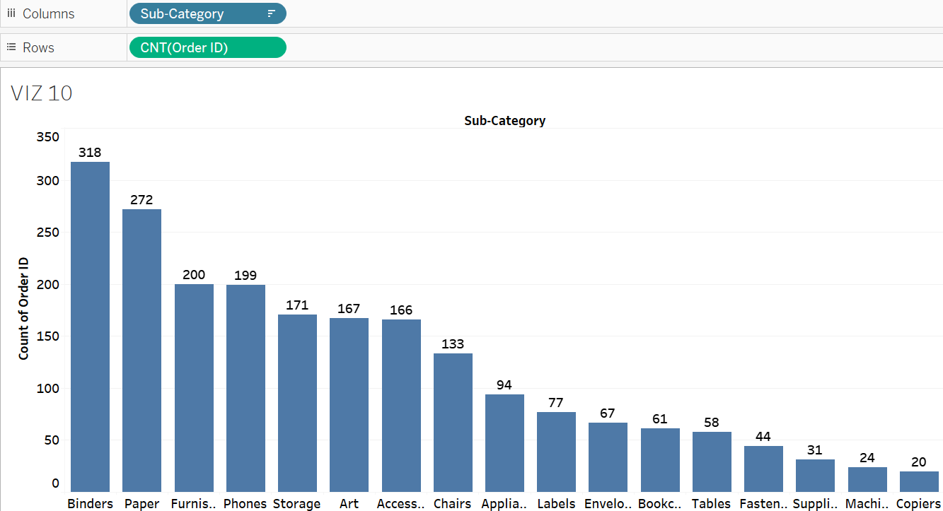
Create a bar graph showing no. of orders per sub category item. Rename the sheet to VIZ 10. What is the total number of orders received for papers? Next, using the Order Date as a filter, determine the number of orders received for papers in 2019 alone.
Solution – Exercise 15
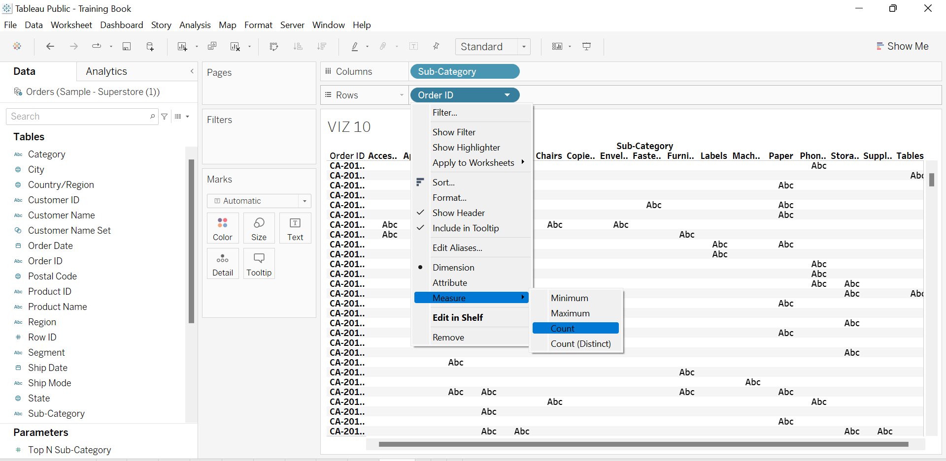
Step 1: Drop the Sub-Category field to the Columns shelf and the Order ID to the Rows shelf. Set the aggregation measure of Order ID to Count. This allows Tableau to compute and display the number of orders received for each sub-category item.
Step 2: The resulting chart based on the entire data shows that the total number of orders received for papers was 1370.
Step 3: Drop Order Date to the Filters shelf and choose Range of Dates.
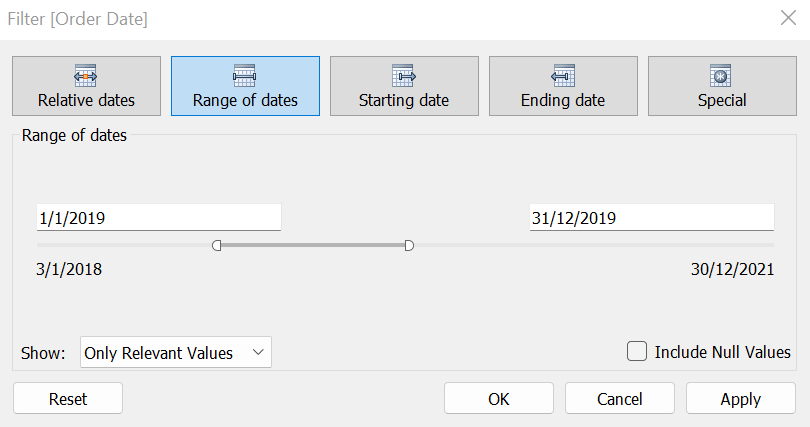
Step 4: Set the date interval from 1/1/2019 to 31/12/2019.
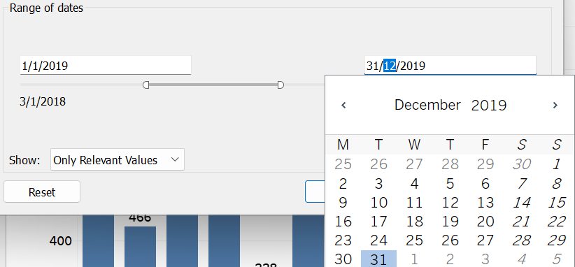
Step 5: The number of orders received for papers within 2019 was 272.
Sorting Data
Tableau enables us to sort dimension members within a visualization. This sorting feature aids in organizing dimension members according to our preferences. Tableau provides five sorting methods, including the commonly used alphabetical and field-based methods. The field-based method, specifically, involves arranging dimension members in either ascending or descending order according to a field’s value. This sorting allows us to quickly identify the most and least significant dimension members, particularly when their mark sizes in the visualization are not easily comparable. Additionally, it provides insights into how the values vary across different dimension members.
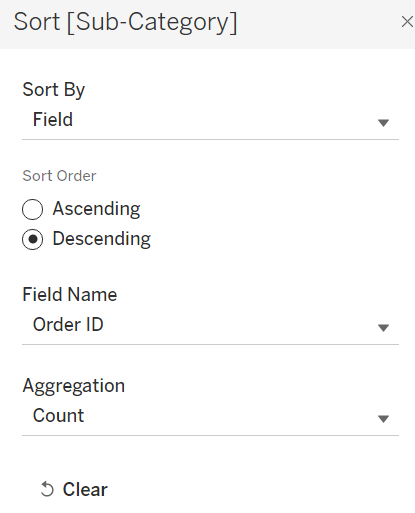
Suppose we aim to arrange the Sub-Category items in VIZ 10 in descending sequence based on their no. of orders. To achieve this, firstly, click the down arrow next to the Sub-Category field available in the Columns shelf and choose Sort.
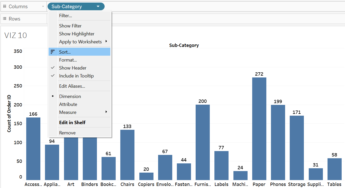
Next, click the drop-down that popped out to select Field.
Lastly, select Descending and pick the correct Field Name and Type of Aggregation to ensure the visualization is sorted accordingly.
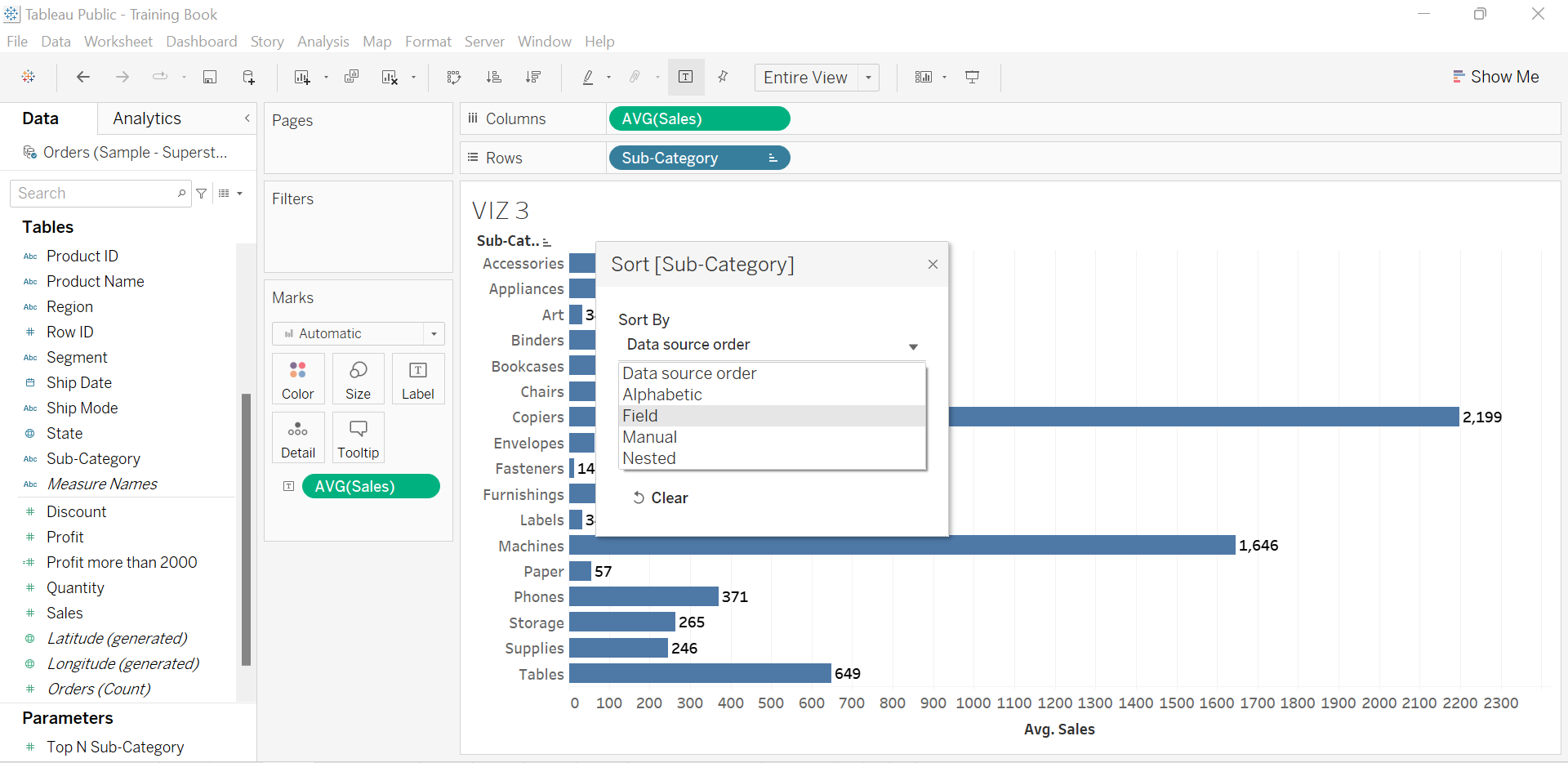
The chart below displays VIZ 3, listing sub-category items sorted in descending order based on average sales.
Interestingly, in Tableau, dimension members can be sorted according to a field that is not directly visualized on the chart. For example, suppose we want to arrange the sub-category items in VIZ 10 based on the average profit contributed by each, rather than their number of orders. In this case, we then can merely edit the sorting setting by switching the field selection to Profit, and setting the aggregation type to Average.
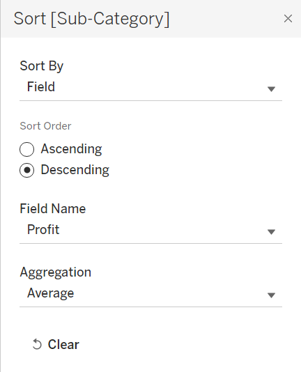
The sorting function in Tableau could lead users to interesting findings. For example, in the current VIZ 10 where sub-category items are sorted by average profit, the analysis concludes the following:
- The no. of orders of the sub-category items is not proportional to their average profit; items with a decent no. of orders may not yield a promising average profit.
- Despite chairs, phones, and accessories generating substantial order volumes, they do not rank among the top profit-making items. This situation suggests the need for management to consider adjusting pricing or enhancing marketing and promotional strategies for these products.